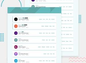
Design comparison
Solution retrospective
Happy new year mentors 🥳🥳!!
I had fun at the start of this project but started having headache when I got to Js functionality part :). I tried my best but seems like things are not working out as it suppose to be, especially in the overall filter button. I’d be happy if you could provide some better option
Quick Note: each list buttons works on mobile phone but has issue on larger screen
There is no space between some elements on mobile phone, this has always been the issue on each of my project. Things seem to work out locally but there’s always issue when it’s live. I’d be happy if you could provide help on this too
Thanks
Community feedback
- @grace-snowPosted almost 4 years ago
Hi, I think this looks really good and works well, you should be pleased with it.
Im not sure what you mean about elements having no space on mobile, all looks like fine spacing to me.
Only change I'd make I think is to read all the data from the json to loop over and create the elements. But that it harder and nothing at all wrong with doing it how you have done with everything in the html already.
Well done, this one isn't the easiest of challenges!
2@Olaleye-BlessingPosted almost 4 years ago@grace-snow
I thought of looping the json data but I didn't know my way round if multiple options are included. I'll try it at a later time
Thanks for the encouragement
0 - @abhik-bPosted almost 4 years ago
Happy new year Olaleye 🎊
Your solution is fantastic and it is very responsive 💯, I liked the hover states and over all it seems perfect
So what I believe went wrong for large screens is your
media-querywhere you give all the.lista display offlex, however for small screens you did not give them anydisplayproperty at all , that's whyhiddenworks on small screen. A quick fix would be something likelist.style.display = "none";instead oflist.hidden = true;Hope this helps 🤞
Happy Coding 😇 and Keep Contributing these awesome solutions 🚀
1@Olaleye-BlessingPosted almost 4 years ago@abhik-b Thanks for the observation. I'd change it to display: none
1
Please log in to post a comment
Log in with GitHubJoin our Discord community
Join thousands of Frontend Mentor community members taking the challenges, sharing resources, helping each other, and chatting about all things front-end!
Join our Discord
