Submitted over 1 year ago
I used HTML, CSS, JavaScript and mediaQuery to complete this challenge
@razeeth11
Design comparison
SolutionDesign
Community feedback
- @doganfurkanPosted over 1 year ago
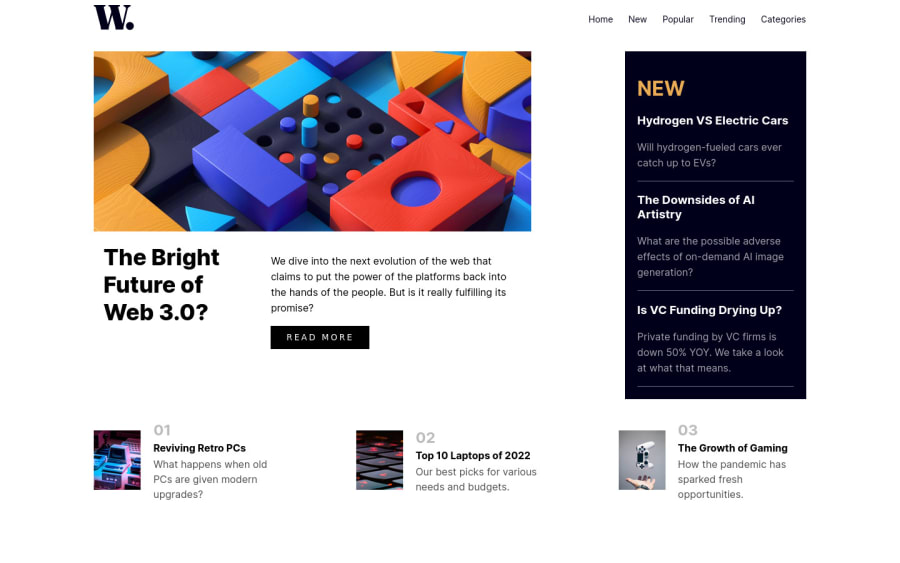
One quick fix would be giving max-width to the main content div instead of the left content div. You see, you have a huge gap between the "The Bright Future of Web 3.0" and "New" sections. If you change the element that has max-width, it should fix that.
Also, it doesn't appear like your solution has the features to be tagged as "#jss #preact #react-query #solid-js #material-ui". I would recommend using true tags. It's not changing anything, but that would be more accurate.
1
Please log in to post a comment
Log in with GitHubJoin our Discord community
Join thousands of Frontend Mentor community members taking the challenges, sharing resources, helping each other, and chatting about all things front-end!
Join our Discord
