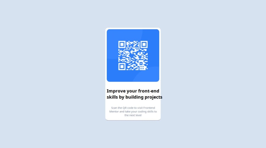
Design comparison
Solution retrospective
what I'm most proud of is that I was able to tackle this project on my own I just started learning how to code and lol but I'm actually able to do something on my own, I'm excited.
what I will do differently is that I will stick to an Idea on how to go about a project and add some of the other ideas I'm having' to it later on, it keeps the project simple and It gives me a direction to work on, that way I won't want to try this and that at the end of the day I've not done anything.
What challenges did you encounter, and how did you overcome them?1.I had too many ideas and I wasn't able to pick a direction- I decided to just pick one at the end of the day lol. 2.I'm still having issues with my box-shadow- i checked online but still not there yet especially the spread, how the negative and positive thing applies to a box maybe I just need to play around with it 3.I'm still having issues with BEM I don't any ideas on how to overcome this sighs maybe it's because I'm new or can someone help me 4.should I have add everything like my colors to my root reset?
What specific areas of your project would you like help with?1 How to go about my root reset- should i add everything like all my styles to it? 2 My spread with the box-shadow I can't make sense of the effect of the negative and positive vale 3.My BEM needs help lol what are the things I can do to improve the structure and everything
Community feedback
Please log in to post a comment
Log in with GitHubJoin our Discord community
Join thousands of Frontend Mentor community members taking the challenges, sharing resources, helping each other, and chatting about all things front-end!
Join our Discord
