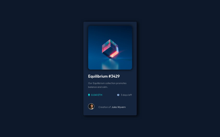
Design comparison
Solution retrospective
In particular, what I found most difficult was to align the image with the text, the image of the diamond and the clock with their respective text on the right. I don't know if it is ideal but what I did was display: inline, margin: 0 auto; and position: relative;, and then I just played with the size of the image so that it was the best possible.
any suggestions, help and feedback? are welcome.
Community feedback
- @PhoenixDev22Posted about 2 years ago
Hello Ricardo,
Congratulation on completing this challenge. Excellent work! I have few suggestions regarding your solution, if you don't mind:
HTML
- The most important part in this challengeinteractive elements. Since there's a :hover state on the image and means it's interactive, So there should be an interactive element around it. When you create a component that could be interacted with a user , always remember to include interactive elements like(button, textarea,input, ..)
for this imagine what would happen when you click on the image, there are two possible ways:
1: If clicking the image would show a popup where the user can see the full NFT, here you use<button>
. 2:If clicking the image would navigate the user to another page to see the NFT, here you can use<a>
.
- The link wrapping the equilibrium image should either have
Sr-only
text, anaria-label
oralt
text that says where that link takes you.
- For any decorative images, each img tag should have empty
alt=""
and addaria-hidden="true"
attributes to make all web assistive technologies such as screen reader ignore those images in( icon-ethereum, icon-clock ).
- Profile images like that avatar are valuable content. The alternate text of the avatar’s image should not be Author-avatar-imagen
, it’s meaningless. You can use the creator's name
Jules Wyvern`. Read more how to write an alt text
- If you wish to draw a horizontal line, you should do so using appropriate CSS. You may remove the
<hr>
, you can useborder-top:
to the avatar's part.
- For middle part of the card
.power
, you can use an unordered list<ul>
, in each<li>
there should be<img>
and<p>
. That way you can align them centrally.
- There are so many ways to do the hover effect on the image, The one I would use is pseudo elements
::before, ::after
. You can use pseudo-elements to change the teal background color to hsla. Then the opacity can be changed from 0 to 1 on the pseudo element on the hover. Also using pseudo elements makes your HTML more cleaner as there's no need for extra clutter in the HTML.
Aside these, your solution looks great. Hopefully this feedback helps.
Marked as helpful0 - The most important part in this challengeinteractive elements. Since there's a :hover state on the image and means it's interactive, So there should be an interactive element around it. When you create a component that could be interacted with a user , always remember to include interactive elements like(button, textarea,input, ..)
for this imagine what would happen when you click on the image, there are two possible ways:
- @correlucasPosted about 2 years ago
Hello Ricardo, congratulations for your solution!
Your solution seems great, also the design. But something caught my attention was the card shadow that was too dark and strong. To create a smooth shadow you need to give it less
opacity
and moreblur
here’s a good value for this shadowbox-shadow: 5px 5px 13px 5px rgb(0 0 0 / 7%);
Fixing that you'll give a better loook for the container and have a smooth shadow.
Hope this helps, happy coding!
Marked as helpful0@ramedina98Posted about 2 years ago@correlucas I have made the necessary changes, thank you very much for your help.
0 - @elaineleungPosted about 2 years ago
Hi Ricardo, welcome to Frontend Mentor, and congrats on completing your first project! This looks very well done to me, and I think if you change the box-shadow values and color, as well as make the card corners a bit rounder, you can get this looking pretty close to the design.
About the alignment, what I did was to use flexbox, and I see that you have flexbox on the parent container of the icon/text groups already. If you add flexbox to the icon/text group, you can just use
align-items: center
to make it vertically centered, as they are now items in a row in flexbox. You can try something like this:<div class="ethereum"> <img class="icon-ethereum" src="imagenes/icon-ethereum.svg" alt="icon-ethereum"> <span>0.041 ETH</span> </div> CSS: .ethereum { display: flex; align-items: center; // for vertical alignment } .ethereum img { margin-right: 0.5rem; // for the spacing between the icon and text }
Hope this can help you even on your next project!
Marked as helpful0@ramedina98Posted about 2 years ago@elaineleung Thank you very much for your help. The flex box is something that sometimes is still not very clear to me, but thanks to your suggestion you have helped me a lot.
0
Please log in to post a comment
Log in with GitHubJoin our Discord community
Join thousands of Frontend Mentor community members taking the challenges, sharing resources, helping each other, and chatting about all things front-end!
Join our Discord