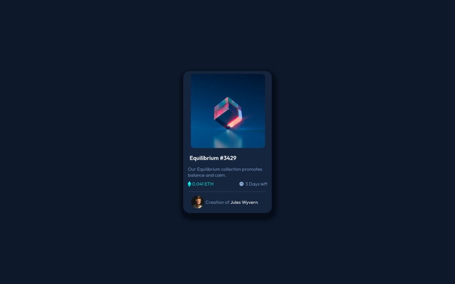
I used Html 5,CSS and Flexbox to complete this Challenge
Design comparison
Solution retrospective
Scope of Improvement in my code?
Community feedback
- @PhoenixDev22Posted almost 3 years ago
hello arunsingh009 ,
I have some suggestion:
-
Anything with a hover style in the design means it's interactive . You need to add an interactive element around the image and Equilibrium #3429 , Jules Wyvern.(in `this challenge is an anchor tag <a>.
-
You can use unordered list <ul> to wrap
<div class="third">
and in each list item would have<img > or <svg>
and<p>
. -
The eye
svg
doesn't really need to be in the html. -
<svg> 's
do not add important information to a document should be considered decorative. You can usearia-hidden="true"
to hide the SVG from screen readers.focusable="false"
is also used to ensure Internet Explorer won’t allow the Tab key to navigate into the SVG.
<div class="middle"> <div class="text"><svg width="48" height="48" xmlns="http://www.w3.org/2000/svg"> --------------------<svg></div> </div>
- No need for
<hr class="hr">
, you can use theborder-top
to the<div class="fourth">
.
CSS
-
box-shadow
is very dark (not matching the design). -
It's better not to style on the ID'S (That's not what they're for). The best way to do that is single class selectors.
-
Let the content inside the card element dictate the
height
of it. Instead of settingwidth
in this, consider usingmax-width
. -
You should use
em
andrem
units .Bothem
andrem
are flexible, scalable units which are translated by the browser into pixel values, depending on the font size settings in your design. Usingpx
will not allow the users to control the size of the page based on their needs. -
I would recommend to check @vanzasetia solution and read the read me file as he explained a lot.
Hopefully this feedback helps.
Marked as helpful2@arunsingh009Posted almost 3 years ago@PhoenixDev22 Thanks for the feedback Buddy I will surely check the solution
0 -
- @denieldenPosted almost 3 years ago
Hi Arun , good work!
To improve your code avoid using the
style
inside html ... good practice is to keep html clean and separate from css.Also to improve the internal spacing of the elements I suggest you to use the css
padding
property which offers greater control and reliability.Hope this helps ;) Happy coding!
Marked as helpful1@arunsingh009Posted almost 3 years ago@denielden Thanks for this valuable feedback I will try to apply this in my upcoming solutions.
1 - @rsrclabPosted almost 3 years ago
Hi, @arunsingh009 ~
Congratulate on your solution to the challenge on FM platform. I have studied your work carefully and learned a lot from it.
Here are some of the tips I like to provide.
- I suggest you to try transition on hoverable elements like heading and creator name.
- Please try BEM for naming element classes. It will help you a lot on bigger projects.
- Eye icon on image overlay isn't on the center of the screen.
https://www.frontendmentor.io/solutions/my-first-solution-on-chanllenge-V-4IzAivH
Here is my solution to this challenge, and if it can help you even a bit, it would be happy to me.
Cheers ~
Marked as helpful1@arunsingh009Posted almost 3 years ago@tymren608 First and foremost, thank you for devoting your valuable time to writing this fantastic feedback. I'd like to learn more about BEM; could you please point me in the right direction? I'll try to improve my solution based on your suggestions.
0@rsrclabPosted almost 3 years ago@arunsingh009 ~
http://getbem.com/introduction/
Here is complete introduction to BEM ~
Happy coding ~
0
Please log in to post a comment
Log in with GitHubJoin our Discord community
Join thousands of Frontend Mentor community members taking the challenges, sharing resources, helping each other, and chatting about all things front-end!
Join our Discord