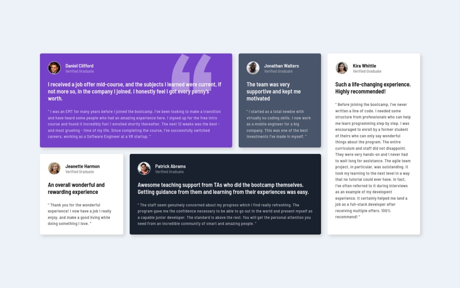
Design comparison
SolutionDesign
Solution retrospective
This is my first challenge, please let me know what things I can change to do better.
Community feedback
- @ChamuMutezvaPosted over 3 years ago
Congratulations for taking your first Frontend Mentor challenge.
- for mobile up to 375px it looks good, thereafter the design breaks.The site has to be presentable across all devices possible. Your
@media (max-width: 375px)must be changed to kick in later - maybe around 600px. If you can add another media query to polish it up , do so. - be wary of multiple h1 headings on a site as it is considered not best practice. See the following article for best use cases. mdn headings
Marked as helpful1@mnazneen20Posted over 3 years ago@ChamuMutezva thank you very much... -I realized the problem but I followed the style guide. In the style guide, they provided the following width: 375px for mobile and 1440px for desktop. -And thank you again for the article, it is very helpful.
0 - for mobile up to 375px it looks good, thereafter the design breaks.The site has to be presentable across all devices possible. Your
- @afrusselPosted over 3 years ago
Nice work ... Great 👍 almost close to design
Marked as helpful0
Please log in to post a comment
Log in with GitHubJoin our Discord community
Join thousands of Frontend Mentor community members taking the challenges, sharing resources, helping each other, and chatting about all things front-end!
Join our Discord
