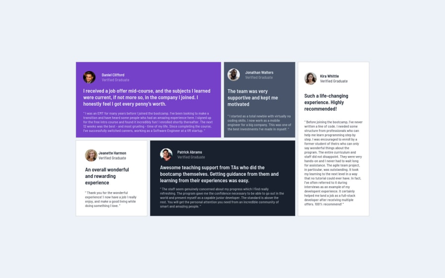
I used Grid, Flexbox and media queries along with HTML and CSS.
Design comparison
Solution retrospective
I used a grid here as I am a beginner that's why I am not satisfied with the work for this challenge. I tried my best for this Challenge, but I am unable to use that quotation image in this challenge and I was unable to position the cards mentioned in the design for mobile phones. If any suggestions do let me know. I will be thankful to all who give suggestions.
Community feedback
- @FoxMalder-coderPosted about 3 years ago
Hi! The cards could be positioned by using "order: number". "number" can have positive or negative value. To put the quotation mark (use the full properties): first set background-color, then set background-image (don't forget you need path like ../images/), background-position and background-repeat. Sometimes we need background-size also but not this case - here size is 100% of origin so we didn't need to correct it.
Marked as helpful0@arunsingh009Posted about 3 years ago@FoxMalder-coder I will definitely try this, btw thanks for feedback.
0
Please log in to post a comment
Log in with GitHubJoin our Discord community
Join thousands of Frontend Mentor community members taking the challenges, sharing resources, helping each other, and chatting about all things front-end!
Join our Discord
