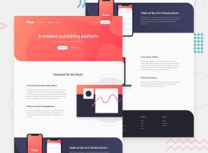
Design comparison
Solution retrospective
i have a diffcult to optmize a links insider
Community feedback
- @jeremiahlateefPosted almost 3 years ago
Hello Karem, always build for the mobile screen before you build the desktop screen. Most users will use a phone to check your site rather than a desktop or a laptop. You did well for the bigger screen but the smaller screen does not display all the features properly. Also, learn what sematic tags means and how to properly apply it to the HTML file.
Marked as helpful0@KaremSherifPosted almost 3 years ago@Jerryl-597 ok bro thanks for supporting me I will take by your ideas
0 - @denieldenPosted almost 3 years ago
Hi Karem, great work on this challenge! 😉
Here are a few tips for improve your code:
- add
margin-inline: autotomax-widthclass to center the page content in the large screen - use
headertag for wrap the navbar and for improve the Accessibility instead of usingsectiontag - add
maintag and wrap the content of page andsectionfor improve the Accessibility - don't forget the
footerin the bottom of page - add descriptive text in the
altattribute of the images - use
buttonisteadatag for the buttons - instead of using
pxuse relative units of measurement likerem-> read here
Overall you did well 😁 Hope this help!
Marked as helpful0@KaremSherifPosted almost 3 years ago@denielden thanks bro those points give me good ideas I'm grateful to you thanks for your time
1 - add
Please log in to post a comment
Log in with GitHubJoin our Discord community
Join thousands of Frontend Mentor community members taking the challenges, sharing resources, helping each other, and chatting about all things front-end!
Join our Discord
