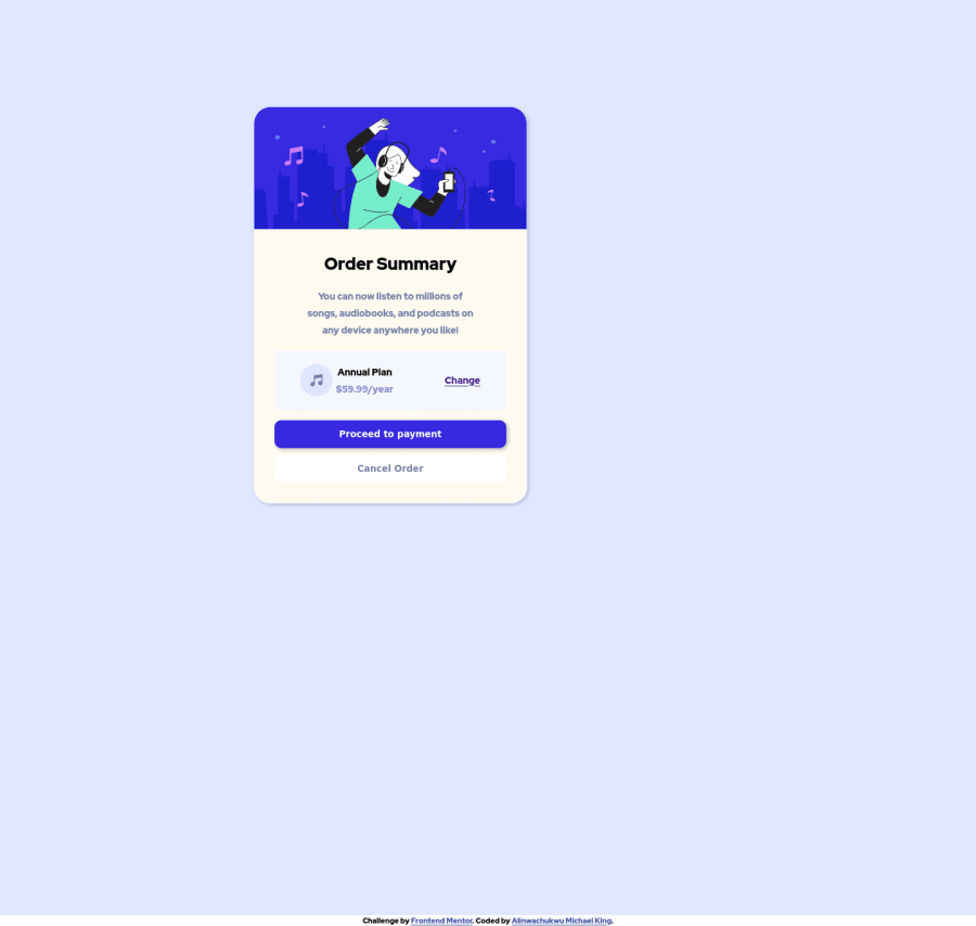
I used Google fonts, I like to work and learn at the same time
Design comparison
Solution retrospective
I tried to add the background img of the div>order-container-wrapper but it didnt work .order-components .order-component-wrapper { width: 80%; height: 100vh; background: url(images\pattern-background-desktop.svg) no-repeat center; background-position: top; display: flex; align-items: center; } i dont know what else i could have done
Community feedback
- @ComanderPotatoPosted over 2 years ago
Good job looks good! I just did the same challenge. I made some changes to center your container, in you're .order-components .order-component-wrapper {code block} remove width of 80%, and in your .order-components .order-component-wrapper .card {code block} remove width of 35% will center your container to the center of your parent. Anyways good job
1@Saintt042Posted over 2 years ago@ComanderPotato Love to schedule a google meet so you could explain to me better, if you don't mind. [email protected]
0
Please log in to post a comment
Log in with GitHubJoin our Discord community
Join thousands of Frontend Mentor community members taking the challenges, sharing resources, helping each other, and chatting about all things front-end!
Join our Discord
