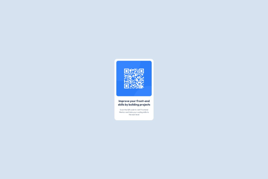
Design comparison
Solution retrospective
I take great pride in having achieved this challenge, especially considering that, although I had some knowledge in the field, it had been a while since I practiced this type of activity. The experience allowed me to overcome what seemed like a significant obstacle and reaffirmed my skills and confidence.
What challenges did you encounter, and how did you overcome them?The biggest challenge in this type of task is reproducing exactly what is in the image. Even when using layout design tools like Figma or XD, achieving a pixel-perfect result is difficult. Making the layout look exactly the same is a significant challenge for any developer
What specific areas of your project would you like help with?I would appreciate help especially with spacing and sizing to improve and tackle other challenges throughout my journey. Additionally, the other parts were easier to handle since I already had prior knowledge in HTML and CSS. Any feedback is welcome; I want to grow and become excellent in my field, and also help other developers.
Community feedback
Please log in to post a comment
Log in with GitHubJoin our Discord community
Join thousands of Frontend Mentor community members taking the challenges, sharing resources, helping each other, and chatting about all things front-end!
Join our Discord
