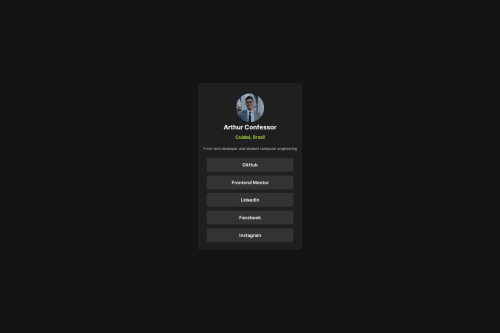
Submitted over 1 year agoA solution to the Social links profile challenge
I used flexbox and padding.
@ArthConf

Solution retrospective
What are you most proud of, and what would you do differently next time?
I'm proud to have used flexbox to center the panel and other flex items. Next time, I want to use GRID.
What challenges did you encounter, and how did you overcome them?I had difficulty reducing the image, without losing so much quality and maintaining the proportion. Furthermore, I had to learn how to use flexbox better
What specific areas of your project would you like help with?I would like help with tips on aligning items, centering faster, moving elements.
Code
Loading...
Please log in to post a comment
Log in with GitHubCommunity feedback
No feedback yet. Be the first to give feedback on Arthur Confessor's solution.
Join our Discord community
Join thousands of Frontend Mentor community members taking the challenges, sharing resources, helping each other, and chatting about all things front-end!
Join our Discord