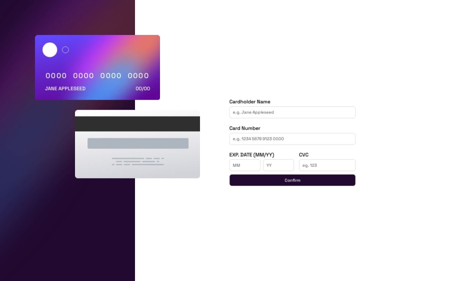
i used flexbox and media querries and position absolute


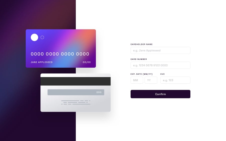
Design comparison
Solution retrospective
making this website responsive was a little difficult and i am unsure about it because its not responsive on all devices and also when positioning the cards was a little bit of challenge because i rarely use position absolute
Community feedback
- @RoksolanaVeresPosted about 1 year ago
Hi, Sarosh! I feel your pain: for me, card positioning in this challenge was also one of the most difficult parts. I did it with position absolute as well. Actually, your solution looks really nice, just add more media queries to change the position of the cards whenever they overlap other content. I tried to make your page more responsive and suggest the following media queries (but obviously you can make something different):
@media screen and (max-width: 1300px) {
  .cardBack {
    left: 7rem;
  }

  .cardDate-cvc {
    flex-direction: column;
  }
}

@media screen and (max-width: 1080px) {
  .cardFront {
    left: 1rem;
  }

  .cardBack {
    left: 1rem;
  }
}

@media screen and (max-width: 880px) {
  .cardBack img {
    width: 15rem;
    height: 8rem;
  }

  .cardBack {
    top: 25rem;
    left: 5rem;
  }

  .cardFront {
    height: 8.3rem;
    width: 15rem;
    top: 15rem;
    left: 3rem;
  }

  .cardDetails img {
    width: 2.8rem;
    margin: 1rem;
  }

  .cardNumber {
    word-spacing: 1px;
    letter-spacing: 1px;
    font-size: 1rem;
    margin-top: 0.8rem;
  }

  .cardName {
    font-size: 0.5rem;
    margin: 0.5rem 1.5rem;
  }
}

@media screen and (max-width: 680px) {
  .container {
    display: flex;
    flex-direction: column;
  }

  .leftContainer {
    background-image: url(../images/bg-main-mobile.png);
    background-size: cover;
    height: 13rem;
    width: 100%;
  }

  .cardBack {
    top: 2rem;
    left: 5rem;
  }

  .cardFront {
    top: 7rem;
    left: 2rem;
    z-index: 1;
  }

  .rightContainer {
    width: 100%;
    margin-top: 3rem;
  }
  form {
    width: 80%;
  }
}
Besides, I've noticed that the background image in .leftContainer repeats in large screens. Just add this property:
.leftContainer {
  background-repeat: no-repeat;
}
And one last thing: you made the confirm button through input type="text". But it's actually a button. You should do it either with the input type="submit"
<input type="submit" class="confirm" value="Confirm" />or with a button tag with type="submit":
<button type="submit" class="confirm">Confirm</button>That's all that I've noticed. Keep going and happy coding 🙂
Marked as helpful0

Please log in to post a comment
Log in with GitHub
Join our Discord community
Join thousands of Frontend Mentor community members taking the challenges, sharing resources, helping each other, and chatting about all things front-end!
Join our Discord