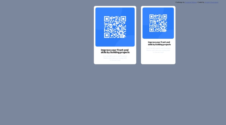
Design comparison
Solution retrospective
How do live Sites URL work I. am confused a little bit.
Community feedback
- @dongmo-shuPosted 10 months ago
Hello @DejMan2003
Congrats on completing the challenge.
As for your questions, I don't quite understand what you mean. Are you referring to how web hosting works? If yes, here is an article on the topic by a reputable hosting company.
Now onto your code. Here are some suggestions I have to improve on the accessibility and validation report.
First
Always separate the page styling from the HTML file. Create a CSS file in the same folder as your HTML file, add the styling to it, and then connect the CSS to the HTML by adding the line
<link rel="stylesheet" href="filename.css">into the <head> section.Second
Have all elements on your page enclosed in an HTML landmark? example of
You can read more on the topic in this article
Third
Always include an Alt text inside of your <img>. You can read more in this article
Fourth
To have the page centered in the middle, I recommend you add this at the top of your page styling.
body{
    min-height: 100vh;
    display: flex;
    align-items: center;
    flex-direction: column;
    justify-content: center;
}
I hope this is helpful
Marked as helpful1@DejMan2003Posted 10 months ago@Singraft Thanks for the advice I’ll try and use that in my future work
1@DejMan2003Posted 10 months ago@Singraft why do you put align items and justify content in the same place don’t they do the same thing?
0@dongmo-shuPosted 10 months agoHello @DejMan2003
They both place elements at the center of the div, once display:flex; has been set.
However, one takes care of horizontal placement, and the other takes care of vertical placement.
0 - @FaithNAPosted 10 months ago
Hello @DejMan2003. Good job on your work. For your question on live sites, do follow the article provided to you by @Singraft. If you need any personal suggestions after you read the article, I tried GitHub pages and Netlify and I recommend using GitHub pages. You have probably already found instructions to guide you on how to go about them, they are not hard to understand.
1 - @danielmrz-devPosted 10 months ago
Hello @DejMan2003!
Your solution looks excelent!
I have just one suggestion:
- In order to make your HTML code more semantic, use
<h1>for the main title instead of<p>. Unlike what most people think, it's not just about the size and weight of the text.
📌 The
<h1>to<h6>tags are used to define HTML headings.📌
<h1>defines the most important heading.📌
<h6>defines the least important heading.📌 Only use one
<h1>per page - this should represent the main heading/title for the whole page. And don't skip heading levels - start with<h1>, then use<h2>, and so on.This change has little or not effect at all on the project, but it makes your HTML code more semantic, improving SEO optimization as well as the accessibility of your project.
I hope it helps!
Other than that, you did a great job!
0 - In order to make your HTML code more semantic, use
Please log in to post a comment
Log in with GitHubJoin our Discord community
Join thousands of Frontend Mentor community members taking the challenges, sharing resources, helping each other, and chatting about all things front-end!
Join our Discord
