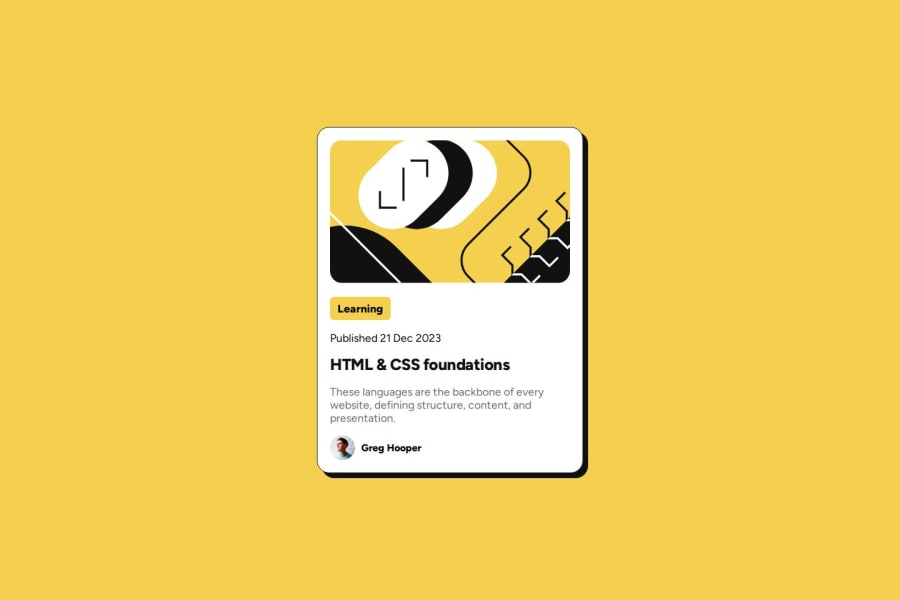


Design comparison
SolutionDesign

Solution retrospective
What are you most proud of, and what would you do differently next time?
That I am continuing to learn new concepts and remember concepts that I have forgotten after some time away from coding.
What challenges did you encounter, and how did you overcome them?It was pretty straight forward but asked AI for one thing I forgot.
What specific areas of your project would you like help with?Just if someone thinks I could of done it in a better/more simplified way.
Community feedback
- @BlackpachamamePosted 28 days ago
Hey your solution is amazing! 🤩
📌 Some accessibility and semantics recommendations for your HTML
- To improve the semantics of your HTML, you can change your
<div class="main">to a<main class="main"> - I recommend doing a small
resetto the styles that come by default in the browsers. To do this, you can apply a couple of properties to the universal selector*, with this you will make your site look the same in all browsers - I leave you the task of researching the
reset CSSand thebox-sizing: border-box - Use
min-heightandmax-width, this will help the content stretch or shrink if you need to. Unlikeheightandwidthwhich can cause your content to be cut off on certain screens. For example, usemin-height: 100vhinstead ofheight: 100vh - You can apply
display: blockto the image to remove the white space generated underneath. Although visually in this case it is irrelevant, it helps you better calculate the space with other elements
Marked as helpful0 - To improve the semantics of your HTML, you can change your
- @yvonnem111Posted 21 days ago
Hi @Blackpachamame,
Thank you for the detailed and very helpful comments:)
1

Please log in to post a comment
Log in with GitHubJoin our Discord community
Join thousands of Frontend Mentor community members taking the challenges, sharing resources, helping each other, and chatting about all things front-end!
Join our Discord