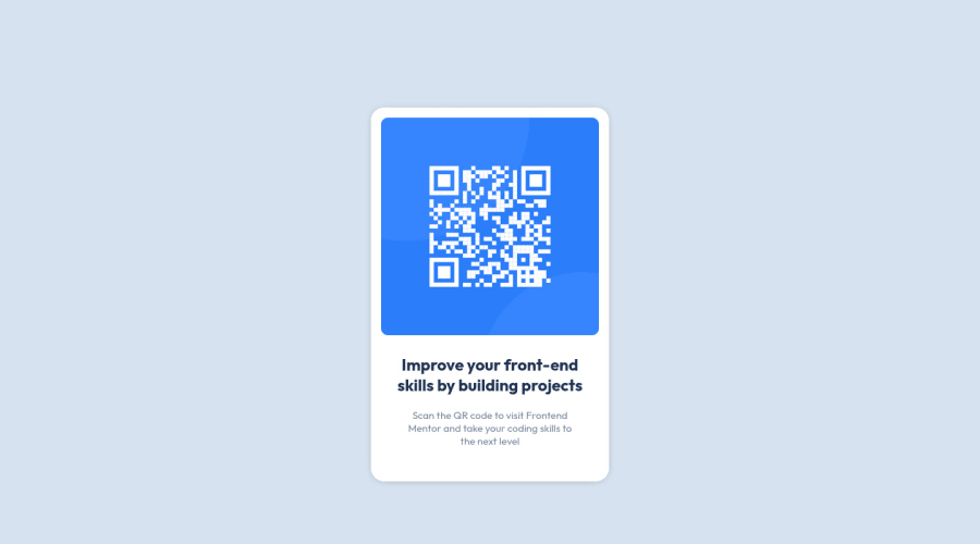
Design comparison
SolutionDesign
Community feedback
- @MelvinAguilarPosted about 2 years ago
Hi @Huseyn823 👋, good job completing this challenge, and welcome to the Frontend Mentor Community! 🎉
I have some suggestions you might consider to improve your code:
- Instead of using
<section>to wrap all the main content, use<main>tag to improve the accessibility of the website.
- Use
<footer>instead of<div class="attribution">. The<footer>element contains authorship information.
- To make alternative texts more worthwhile, add descriptive text to the alt attribute of the QR image to explain what the QR image does. Upon scanning the QR code, you will be redirected to the frontendmentor.io website, so an example of alternative text would be "QR code to frontendmentor.io". You can read more about alternative text here.
- Instead of using pixels in font size, use relative units of measure like
remorem. The font size in absolute length units (px) does not allow users with limited vision to change the text size in some browsers. Reference.
- Use
min-height: 100vhto thebodyselector instead ofheight. This property lets you set a height and let the element grow even more if necessary.
- Setting a defined
heightfor the card component is not recommended. The content should define the component height, otherwise, it will not be allowed to extend beyond your specifications. Alternatively, you can usemin-height.
Above all, the project is done well👏. I hope those tips will help you! 👍
Good job, and happy coding! 😁
Marked as helpful2@Huseyn823Posted about 2 years ago@MelvinAguilar thanks for your comment i will definetly improve myself in future projects
1 - Instead of using
Please log in to post a comment
Log in with GitHubJoin our Discord community
Join thousands of Frontend Mentor community members taking the challenges, sharing resources, helping each other, and chatting about all things front-end!
Join our Discord
