Submitted about 1 year ago
i used display: flex; flex-direction: column; justify-content:
@PatrickMonteron12
Design comparison
SolutionDesign
Solution retrospective
What are you most proud of, and what would you do differently next time?
i used dev tools also
What challenges did you encounter, and how did you overcome them?the challenging part is writing the code because i am not really efficient in writing a code
What specific areas of your project would you like help with?at a the css
Community feedback
- @N-laraPosted about 1 year ago
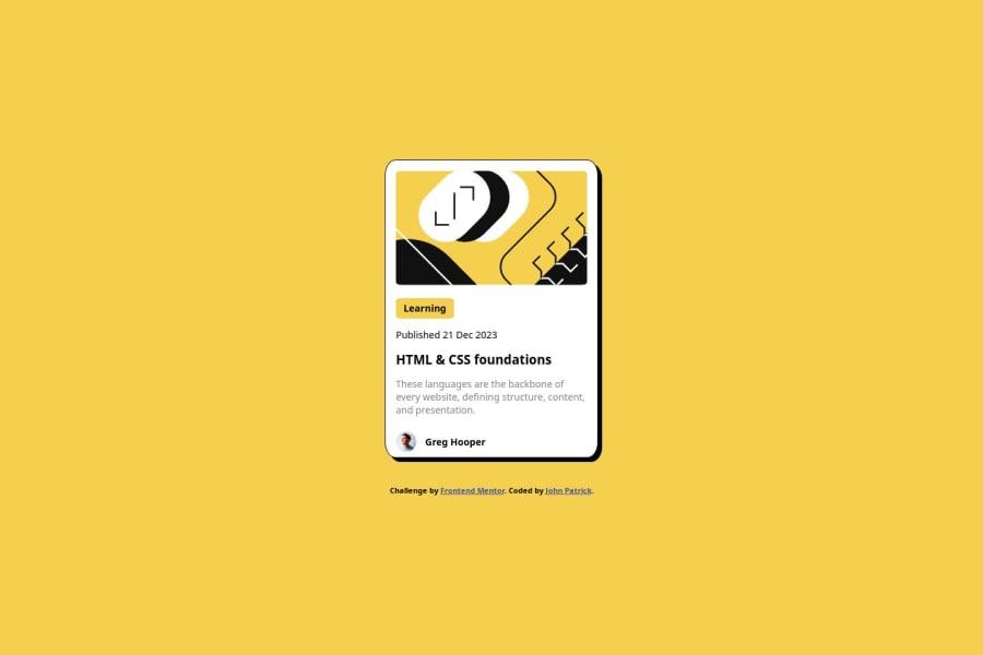
I feel like the border-radius of the pic is a little off and your image width and height are a little small and the heading (card title) font-size is a little small but besides from that it looks great. great use of semantic HTML tags.
0
Please log in to post a comment
Log in with GitHubJoin our Discord community
Join thousands of Frontend Mentor community members taking the challenges, sharing resources, helping each other, and chatting about all things front-end!
Join our Discord
