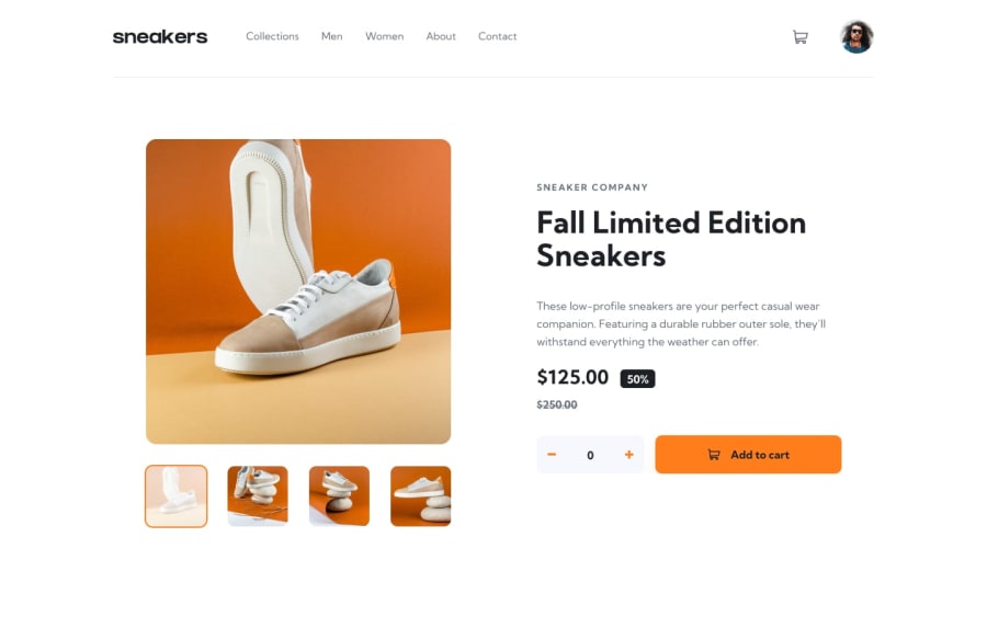
Design comparison
SolutionDesign
Solution retrospective
Please tell me if you have some betters suggestions
Community feedback
- @SheddieyPosted about 1 year ago
Some contents are overflowing on small screens, I would suggest you add margin-inline....
0 - @Alokray007Posted about 1 year ago
Good going. Things look fine just need to work on colors, sizes and look. All the best.
0 - @mm232323Posted about 1 year ago
You can improve your design with transition-duration and animations and make your design more clear and big
0
Please log in to post a comment
Log in with GitHubJoin our Discord community
Join thousands of Frontend Mentor community members taking the challenges, sharing resources, helping each other, and chatting about all things front-end!
Join our Discord
