
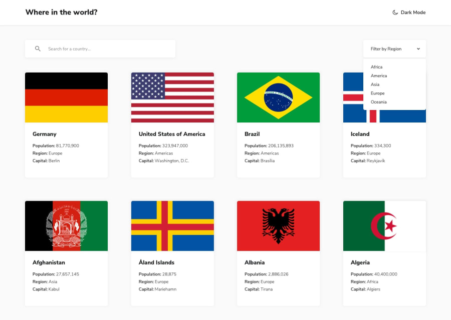
I used css media query and flexbox for responsive website.

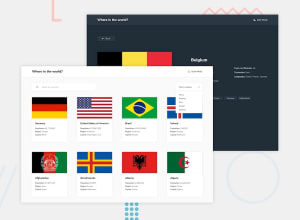
Design comparison
Solution retrospective
These project good for who learn recently learn about APIs and fetching data so, i am also learn these thing recently and i face difficulties and how to solve any problems and so on. thankyou for this project
Community feedback
- @TedJenklerPosted 3 months ago
Hi @JakkaThirumalesh,
Nice project! I have a few ideas for improvements:
I would recommend building a custom select component instead of using the default input one. This would allow you to add animations and nice hover effects, along with a rotate animation, to make your project really stand out.
In projects where items should have the same size, using Grid is crucial, while Flexbox is better suited for layouts where flexibility is needed. Try learning Grid, then redo this project and see how much you will learn. The difference in responsiveness will be huge. Currently, the tablet view isn’t responsive, and the spacing is inconsistent.
The selected flag part works great, and that’s an excellent example of where Flexbox shines.
Overall, great work, and I hope this feedback was helpful.
Best, Teodor
Marked as helpful0

Please log in to post a comment
Log in with GitHub
Join our Discord community
Join thousands of Frontend Mentor community members taking the challenges, sharing resources, helping each other, and chatting about all things front-end!
Join our Discord