Submitted about 4 years ago
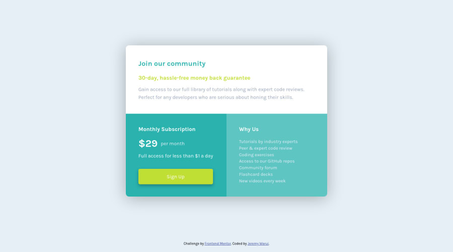
I used CSS grid layout to meet the challenge
@JeremyWarui
Design comparison
SolutionDesign
Solution retrospective
It was a tough one but I managed to finish it. CSS Grids are quite fun to work with. I enjoyed. Any ideas that you guys can share on how you arrived at the solution? I kinda used quite a long way. Ha ha!
Community feedback
- @ApplePieGiraffePosted about 4 years ago
Hey, good job on this challenge, JeremyWarui! π
Your solution looks good in both the desktop and mobile layouts! Your HTML is rather semantic, too, so kudos for that! π
I suggest,
- Switching to a mobile-friendly layout sooner than 395px so that a horizontal scroll bar doesn't appear along the bottom of the page when the width of the screen decreases.
- This is a very tiny thingβbut adding a subtle hover state to the button (such as a change of background-color) would be a nice touch! π
Keep coding (and happy coding, too)! π
0@JeremyWaruiPosted about 4 years ago@ApplePieGiraffe Hey, thanks a bunch! Your words have encouraged me. I will keep on till I pass your level. Haha!!
0
Please log in to post a comment
Log in with GitHubJoin our Discord community
Join thousands of Frontend Mentor community members taking the challenges, sharing resources, helping each other, and chatting about all things front-end!
Join our Discord