

Design comparison

Solution retrospective
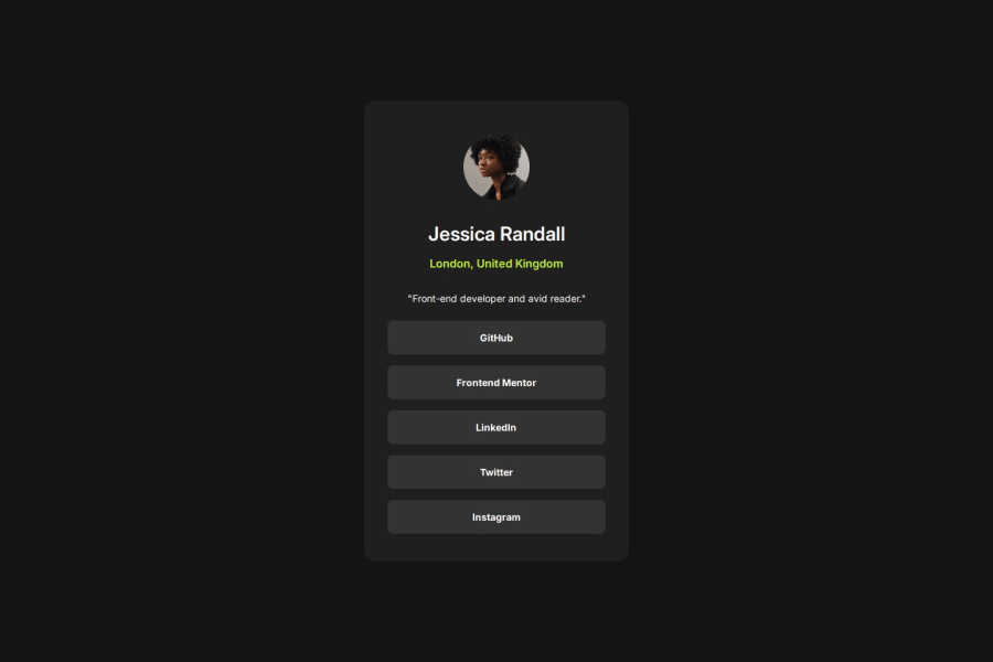
I'm proud of how I used Flexbox to create the profile container, I would add the anchor tag to make the links functional.
What challenges did you encounter, and how did you overcome them?The challenge I encounterd was an error when submitting the project to GitHub, I needed to change the branch and origin. I accomplished this by removing the initial git folder and re initializing Git in the project.
What specific areas of your project would you like help with?I really do not have any specific area, but any helpful comments would be appreciated.
Community feedback
- @benssssssPosted 4 months ago
Congrats, your code is good,
but you can do some little changes
We have a only main div, so you can use display: flex; on body instead grid, grid is used to position many cards, not only one
Then apply a flex-direction to do all content stay one below another
body {
 display: flex;
 flex-direction: column;
}
Icon, fullname, location, and description could be in a div, then the same width of <ul> can be applied in, because in the 500px responsive, the description became wider than the buttons
An id has been set to <h1> could be a class instead
Margins on <li>, could be removed and a padding bigger can be applied on main container (profileContainer) instead
0

Please log in to post a comment
Log in with GitHubJoin our Discord community
Join thousands of Frontend Mentor community members taking the challenges, sharing resources, helping each other, and chatting about all things front-end!
Join our Discord