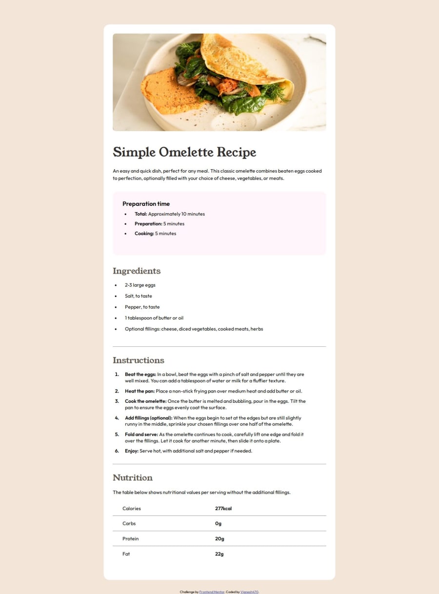
I used CSS Flexbox, Grid and Media queries methods in this challenge.
Design comparison
Solution retrospective
#Usage of accessibility
I have used some accessibility marks in this challenge. Please comment if I have done any accessibility mistakes and also tell me how to improve accessibility in my code.
Community feedback
- @danielmrz-devPosted 9 months ago
Hello @Vignesh470!
Your solution looks excellent!
I have a suggestion about your code that might interest you:
š If you don't have the Figma design files, I recommend using a browser extension called Perfect Pixel.
It allows you to compare your finished project with the design images that come along when you download the project and check the (almost exact) dimensions. It's very useful!
I hope it helps you in future projects! š
Other than that, great job!
Marked as helpful1@Vignesh470Posted 9 months agoHi @danielmrz-dev !
Thanks for the crucial tip which you provided me at the right time!
I was always thinking about how to create a perfect matching solution as compared to challenge design images. Now I am clear.
1
Please log in to post a comment
Log in with GitHubJoin our Discord community
Join thousands of Frontend Mentor community members taking the challenges, sharing resources, helping each other, and chatting about all things front-end!
Join our Discord