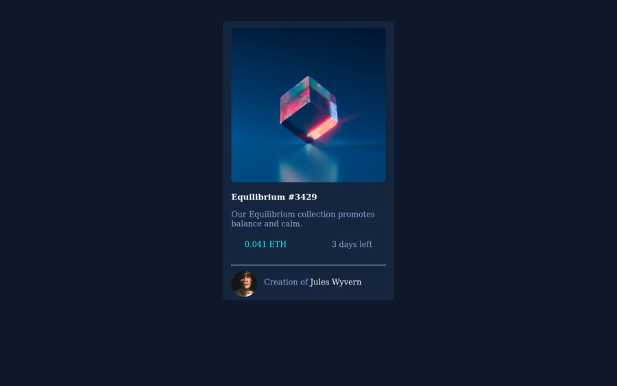
Design comparison
Solution retrospective
I found a lot of it difficult. I did the best i could but towards the end i started using relative positioning which isn't necessarily bad but it's kind of a shortcut and i want to learn how to do it properly. I also struggled with the hovering over the image part as well as inserting those little icons.
Community feedback
- @GabrielBC2021Posted over 2 years ago
Hello :D
Just little details and tips
1.- Try putting all your files in folders, like the images from the project you can create a
image
folder, by doing this you are more organized and if someone watch your code they will understand what you are doing.2.- You didn't include the font family that comes in the
style-guide
file, try importing it so your website looks better.3.- You can use either Flexbox or Grid to this project, it helps a lot and will reduce your CSS code.
Little details that will make your website look way better :D
Marked as helpful1@LucasdudePosted over 2 years ago@GabrielBC2021 Hi i really appreciate the tips! I'm still learning coding and web development and want to get better at my html and css. I'm going to try again to submit it because I want to do better and add the icons and the font. But how can I change the font-family again? I see it says Family: Outfit but I'm unsure of how to apply it to my css and html files.
0@GabrielBC2021Posted over 2 years ago@Lucasdude If you are having problems importing the font family to your HTML you can import it to your CSS file, doing the next thing in top of your CSS file:
@import url('https://fonts.googleapis.com/css2family=Outfit:wght@300;400;600&display=swap');
:root { --Font-family: 'Outfit', sans-serif; }
Now you can add your font family in your body tag like this:
body { font-family: var(--Font-family); }
With this you should be fine and in my personal opinion, is shorter than importing it to your HTML. If you have more questions feel free to ask, good luck :D
Marked as helpful1@LucasdudePosted over 2 years ago@GabrielBC2021 Ok i think i did it correctly. Thank you so much! Also i noticed when you hover over the image the image gets brighter and shows an eye icon as well as there is a shadow in the background. Could you also help me out with that?
0@GabrielBC2021Posted over 2 years ago@Lucasdude Sure, mmm in my profile you can see the dame project but with my solution, you can check it out and if you have questions you can tell me.
Marked as helpful1
Please log in to post a comment
Log in with GitHubJoin our Discord community
Join thousands of Frontend Mentor community members taking the challenges, sharing resources, helping each other, and chatting about all things front-end!
Join our Discord