Not Found
Not Found
Not Found
Not Found
Not Found
Not Found
Not Found
Not Found
Not Found
Not Found
Not Found
Not Found
Not Found
Not Found
Not Found
Not Found
Not Found
Not Found
Not Found
Not Found

Submitted

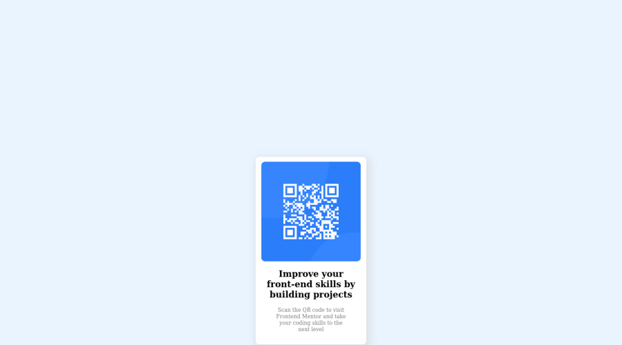
I used CSS and HTML for creating a qr-code for windows and mobile

Enis67β€’ 140

@Enis67

Desktop design screenshot for the QR code component coding challenge

This is a solution for...

  • HTML
  • CSS
1newbie
View challenge

Design comparison


SolutionDesign

Solution retrospective


What is not good in my css for relative? Another better ways to accomplish it?

What did you find difficult while building the project? Which areas of your code are you unsure of? Do you have any questions about best practices?

Community feedback

@MelvinAguilar

Posted

Hello there πŸ‘‹. Good job on completing the challenge !

I have some suggestions about your code that might interest you.

Metadata πŸ—ƒοΈ:

  • The lang attribute is used to declare the language of the webpage. Add the lang attribute to the <html> tag with the value en.
  • The viewport meta tag is missing. the viewport meta tag is used to control the layout of the page on mobile devices. Add the viewport meta tag to the <head> tag: <meta name="viewport" content="width=device-width, initial-scale=1.0">.

    You can check your solution on a mobile device to see how your solution is distorted by not using this tag. ⚠️

HTML 🏷️:

  • Wrap the page's whole main content in the <main> tag.
  • Since this component involves scanning the QR code, the image is not a decoration, so it must have an alt attribute. The alt attribute should explain its purpose. e.g. QR code to frontendmentor.io

CSS 🎨:

  • To center an element vertically, you should use a height to its container. In this case it is recommended to use "min-height: 100vh" so that it occupies 100% of the viewport height. e.g.: body { min-height: 100vh; }
  • Setting the width of the component with a percentage or a viewport unit will behave strangely on mobile devices or large screens. You should use a max-width of 320px or 20rem to make sure that the component will have a maximum width of 320px on any device, also remove the width property with a percentage value.

CSS Reset πŸ”„:

  • You should use a CSS reset. A CSS reset is a set of CSS rules that are applied to a webpage in order to remove the default styling of different browsers.

    CSS resets that are widely used:

I hope you find it useful! πŸ˜„ Above all, the solution you submitted is great!

Happy coding!

Marked as helpful

0

Please log in to post a comment

Log in with GitHub
Discord logo

Join our Discord community

Join thousands of Frontend Mentor community members taking the challenges, sharing resources, helping each other, and chatting about all things front-end!

Join our Discord