Submitted about 1 year ago
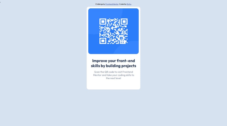
I used css and google fonts and html and margin auto and width percent
#accessibility
@rufusshakin300
Design comparison
SolutionDesign
Solution retrospective
What are you most proud of, and what would you do differently next time?
I would improve html semantics
What challenges did you encounter, and how did you overcome them?I find the Figma design and fonts are very helpful and put my basics in this projec to obtain desired result
What specific areas of your project would you like help with?Html,Css,I learn how to use figma , google font
Community feedback
Please log in to post a comment
Log in with GitHubJoin our Discord community
Join thousands of Frontend Mentor community members taking the challenges, sharing resources, helping each other, and chatting about all things front-end!
Join our Discord
