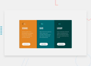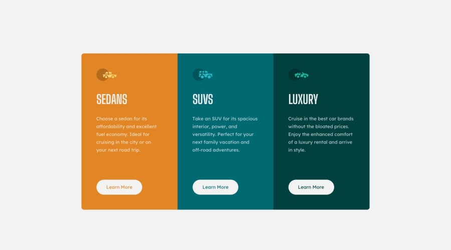
Design comparison
Solution retrospective
Your feedbacks are welcomed please let me know if you think i can improve somewhere thanks in advance
Community feedback
- @fidellimPosted about 3 years ago
Hi @codeekta28,
Great job finishing the project! It looks great on desktop and mobile devices. There's is just a weird view of the component between 765px and 570px. You might want to have a look at that.
Marked as helpful0@codeekta28Posted about 3 years ago@fidellim Your response is the first response given to me in this site and it will be valuable, I will rectify the issue. Thanks for responding
0 - @buneeIsSloPosted about 3 years ago
Hey! @codeekta, Great job on this challenge. You're just missing some padding on top of the first card in mobile-view and icons of the SUV and Luxury cards are incorrect.
Hope this helps :)
Marked as helpful0
Please log in to post a comment
Log in with GitHubJoin our Discord community
Join thousands of Frontend Mentor community members taking the challenges, sharing resources, helping each other, and chatting about all things front-end!
Join our Discord
