Submitted 18 days ago
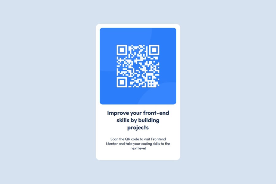
I used basic tools, such as display flex and width.
@leonardoalmeida7
Design comparison
SolutionDesign
Community feedback
- @ChefJTaylorPosted 18 days ago
Page is responsive when I resized my windows. I went through your code and didn't see anything that really stood out to me. Semantic HTML was clean and easy to follow. Code was well structured and readable. The only difference from the solution was the size of the background elements.
Marked as helpful0 - @BabyjenxPosted 18 days ago
Layout looks really good! QR code stays centered and at a fixed size when window is adjusted smaller/bigger. Code looks really clean to me. Size of QR card could be reduced by 25%. Copy line breaks could be better matched.
Marked as helpful0
Please log in to post a comment
Log in with GitHubJoin our Discord community
Join thousands of Frontend Mentor community members taking the challenges, sharing resources, helping each other, and chatting about all things front-end!
Join our Discord
