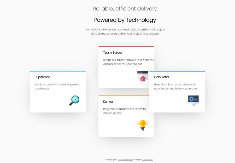
I used Atom editor for making this desktop design.
Design comparison
Solution retrospective
Please tell me anything that might be wrong or needs an addition, your feedback would be appreciated.
Community feedback
- @julianhv20Posted over 4 years ago
You are currently using the position property to distribute the cards in the layout which is not the proper way. The best way to make layouts is using flexbox and grid. These guides and games will help you improve your skills
Flexbox : https://css-tricks.com/snippets/css/a-guide-to-flexbox/ Grid : https://css-tricks.com/snippets/css/complete-guide-grid/
I recommend these two games: Flexbox froggy : https://codepip.com/games/flexbox-froggy/ Grid garden : https://codepip.com/games/grid-garden/
1@ZunairIqbalPosted over 4 years ago@julianhv20 Thank you for your feedback. I appreciate your advice.
0 - @pazsperaPosted over 4 years ago
Hello Zunair! Using grid and flexbox for the card layout would be much easier that the position property. The resources linked on the previous content are really good to start learning them. I'll add one more for grid https://scrimba.com/course/gR8PTE. This is a free short video course that really helped understand how grid works when I first got into it. Hope it helps!
0
Please log in to post a comment
Log in with GitHubJoin our Discord community
Join thousands of Frontend Mentor community members taking the challenges, sharing resources, helping each other, and chatting about all things front-end!
Join our Discord