Submitted about 1 year ago
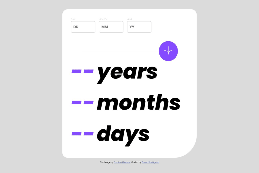
I use Vanilla Js and Css
#accessibility#vanilla-extract

@TkDevk

Design comparison
SolutionDesign

Solution retrospective
It was fun to do and i learned a lot
PD: it couldn't show the label tag and input in red color when the value was wrong, i tried several times but i gave up lol, i failed in that one. It works, just check it out ;)
Community feedback
Please log in to post a comment
Log in with GitHub
Join our Discord community
Join thousands of Frontend Mentor community members taking the challenges, sharing resources, helping each other, and chatting about all things front-end!
Join our Discord