I use the rem unit to make the text responsive


Design comparison

Solution retrospective
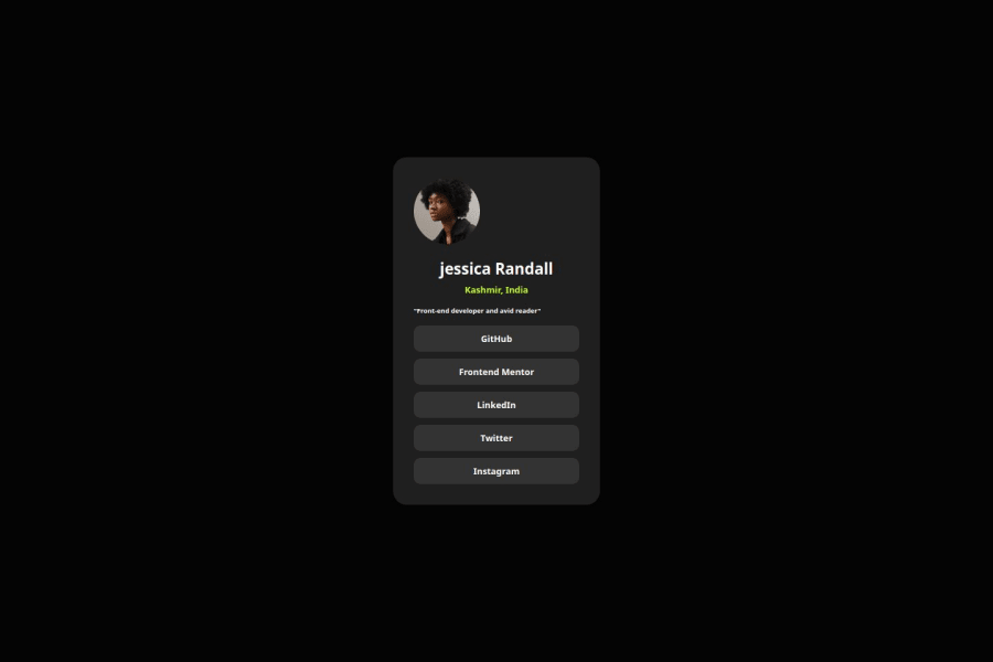
I’m most proud of how I was able to implement the responsive design in my Social Link Profile project. Using flexbox and media queries, I managed to ensure that the profile looks great on both desktop and mobile devices. I also successfully incorporated hover effects to improve the user experience and make the profile more interactive.
What challenges did you encounter, and how did you overcome them?Challenges: I struggled with setting the real dimension sizes for this project as there was no Figma design available, making it difficult to determine the exact width, height, and font sizes.
Solution: I relied on responsive design principles using flexbox for layout, media queries for screen adjustments, and relative units like rem for scalable font sizes to create a flexible, adaptable design.
Community feedback
Please log in to post a comment
Log in with GitHub
Join our Discord community
Join thousands of Frontend Mentor community members taking the challenges, sharing resources, helping each other, and chatting about all things front-end!
Join our Discord