Design comparison
SolutionDesign
Solution retrospective
What did you find difficult while building the project?
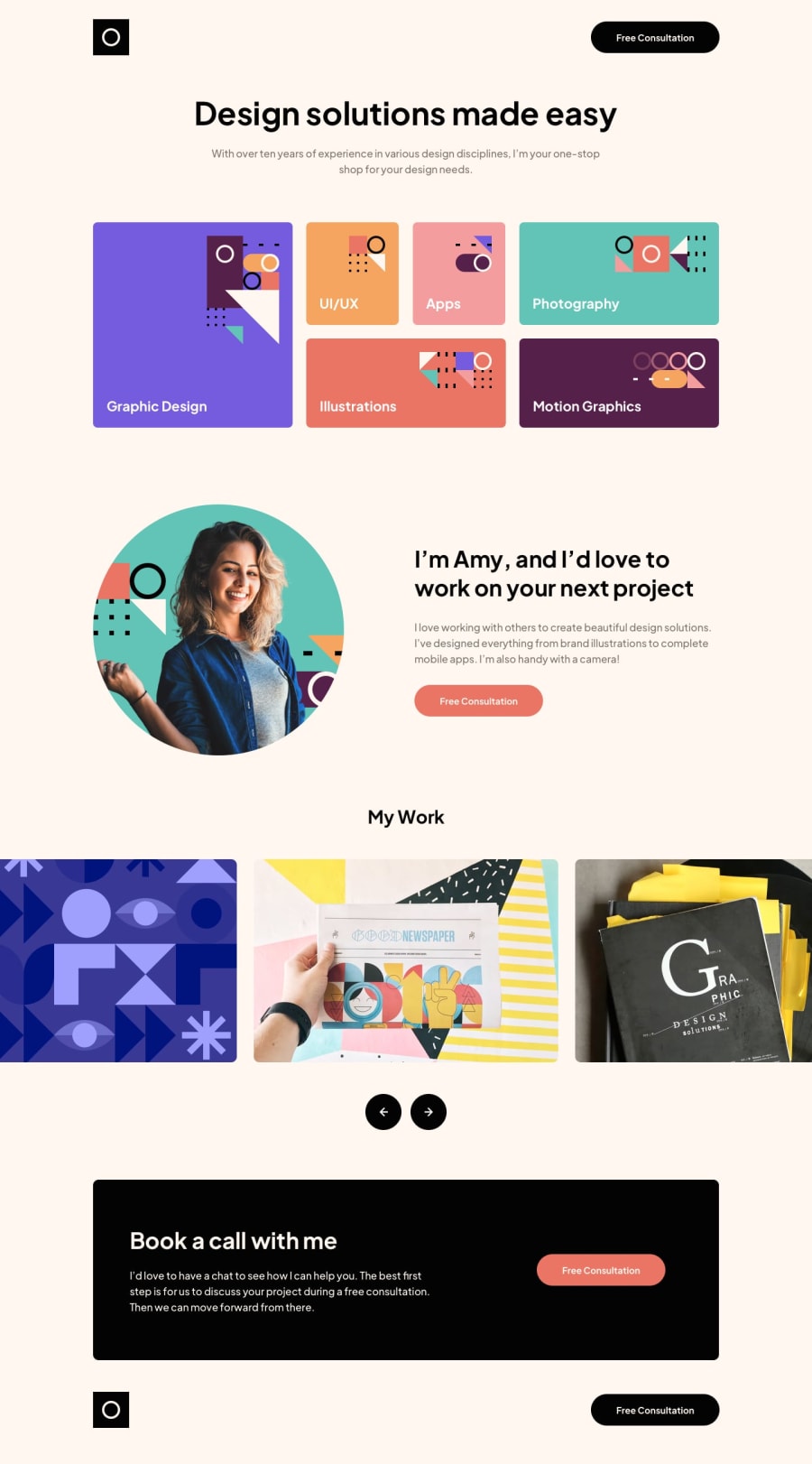
- When it comes to the responsiveness of the images for the second section, I know it's better to use a grid, but I'm not very familiar with it. So, I use flex.
Which areas of your code are you unsure of?
- In the image slide section, for large screens, it should display three images, but currently, it only displays one.
Do you have any questions about best practices?
- Any tip will help me since Im not so good in CSS. Thanks!
Community feedback
Please log in to post a comment
Log in with GitHubJoin our Discord community
Join thousands of Frontend Mentor community members taking the challenges, sharing resources, helping each other, and chatting about all things front-end!
Join our Discord
