

Design comparison

Solution retrospective
The challenge is very interesting
What challenges did you encounter, and how did you overcome them?very easy
What specific areas of your project would you like help with?amazing
Community feedback
- @AdrianoEscarabotePosted 6 months ago
Hi mahdigithubr, how’s everything? I think your project turned out great! However, I have some feedback that I think might be useful:
Since this project is only based on a single page component, there is no need for a h1 tag. It's always a good idea to prevent accessibility errors, so I believe it would be beneficial for you to add a "h1" in this component. Don't worry if you forget about "h1," though; it's a good practice for when you are developing larger sites.
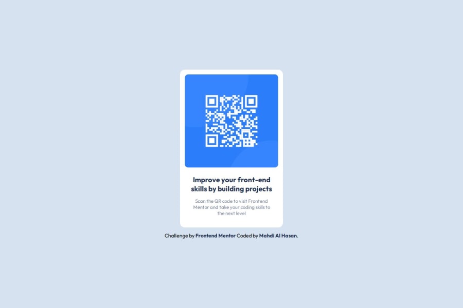
<h1>Improve your front-end skills by building projects</h1>images must have alt text unless it is a decorative image, for any decorative image each IMG tag must have empty alt="" and add aria-hidden="true" attributes to make all the assistive technologies of the Web, as screen reader.
Learn the differences between decorative/meaningless images vs important content.
The rest is amazing.
I hope this is helpful. 👍
0 - P@adhSwedePosted 6 months ago
Pros:
- Code format is nice and readable
- Nailed the dimensions.
- Colors are on point.
- End result is pretty spot on (only downside is the attribution tag pushing everything up a bit)
Cons (Not really in your case, just a few heads up):
- I would use an H1 instead of an H4 for semantics, since it is the main heading on the page.
- Could do with a bit less divs and a little more semantic tags. e.g. <main> <footer>
Summary: All in all Amazingly done on the styles, the use semantics and the use of H1 are the only things i would improve here.
Bonus tip: For my attribution tags I've went with an absolute position about 2 rem from the bottom, it takes the element out of the normal flow and in your case it would have made your solution 1:1 with the design since you were already good on the dimensions.
0


Please log in to post a comment
Log in with GitHubJoin our Discord community
Join thousands of Frontend Mentor community members taking the challenges, sharing resources, helping each other, and chatting about all things front-end!
Join our Discord