i use properties: transform translate position box-sizing,...


Design comparison

Solution retrospective
I want to know which solution is the most optimal for the web, and why that solution is used instead of other solutions.
Community feedback
- @BlackpachamamePosted 26 days ago
Hey your solution is amazing! 🤩
📌 Some accessibility and semantics recommendations for your HTML
- To improve the semantics of your HTML, you can change your
<div class="attribution">to a<footer class="attribution"> - Instead of using
marginto center your content in the center of the screen, you can use theflexboxproperties in thebody:
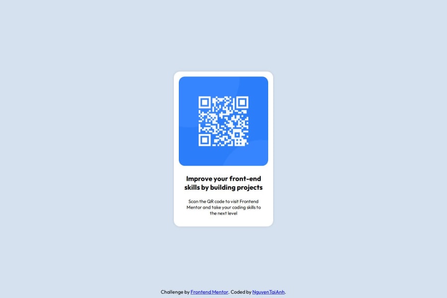
body { background-color: #D5E1EF; font-family: "Outfit", serif; margin: 0; padding: 0; display: flex; justify-content: center; align-items: center; min-height: 100vh; } .container { width: 320px; height: 499px; background-color: white; padding: 16px; border-radius: 20px; box-sizing: border-box; box-shadow: 0 0 10px rgba(0, 0, 0, 0.1); }- I recommend doing a small
resetto the styles that come by default in the browsers. To do this, you can apply a couple of properties to the universal selector*, with this you will make your site look the same in all browsers - I leave you the task of researching the
reset CSSand thebox-sizing: border-box - You can apply
display: blockto the image to remove the white space generated underneath. Although visually in this case it is irrelevant, it helps you better calculate the space with other elements
Marked as helpful1 - To improve the semantics of your HTML, you can change your
- @NguyenTaiAnhPosted 26 days ago
Hey Marcos Travaglini,
Thank you so much for your kind words and valuable feedback!
I really appreciate you pointing out the accessibility and semantics improvements, especially the suggestion to use <footer> instead of a <div>. That makes total sense!
Also, your recommendation to use Flexbox for centering instead of relying on margins is super helpful—I'll definitely apply that technique in future projects. And thanks for the reminder about display: block for images to avoid unnecessary white space!
I forgot to include reset CSS and box-sizing: border-box—my mistake! Thanks for pointing it out and reminding me. I'll make sure to apply them properly in the future.
Regarding the method for centering content, I noticed that using display: flex in the body is a great approach, but I also know that display: grid with place-items: center or other techniques can achieve similar results. I’m curious—what makes Flexbox the best choice in this case? Would love to hear your thoughts on this! 😊
Your feedback really helps me grow as a developer
Thanks again! 😊
1

Please log in to post a comment
Log in with GitHubJoin our Discord community
Join thousands of Frontend Mentor community members taking the challenges, sharing resources, helping each other, and chatting about all things front-end!
Join our Discord