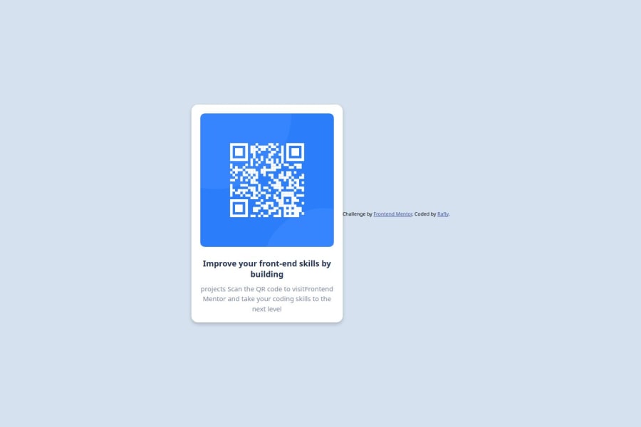
Design comparison
SolutionDesign
Solution retrospective
What are you most proud of, and what would you do differently next time?
i know the structure the styling with css
What challenges did you encounter, and how did you overcome them?first i confuse how to make the background the qr use the div selector or body selector
What specific areas of your project would you like help with?i think the layouting use css
Community feedback
- P@lia-oliveiraPosted 5 months ago
You did a great job! It looks very close to the original—congratulations! Suggestions for making it look even closer to the original:
- Consider downloading the font indicated in the style guide and placing it in a folder within your project, then linking to it in your CSS. The font is available for free on Google Fonts.
- In your CSS, apply the font, font size, and line height specified in the style guide to the main heading you wrapped in <h1> tags and to the <p> text. 3.Try not to break up the text manually. Instead, adjust the line breaks according to the box widths in Figma.
- To move the footer lower on the page, try using display: flex on the body as you did, and add flex-direction: column;.
- For your GitHub repo, consider uploading only the files that are part of your project, without extra references. Alternatively, you could create a separate folder to store references."
0
Please log in to post a comment
Log in with GitHubJoin our Discord community
Join thousands of Frontend Mentor community members taking the challenges, sharing resources, helping each other, and chatting about all things front-end!
Join our Discord
