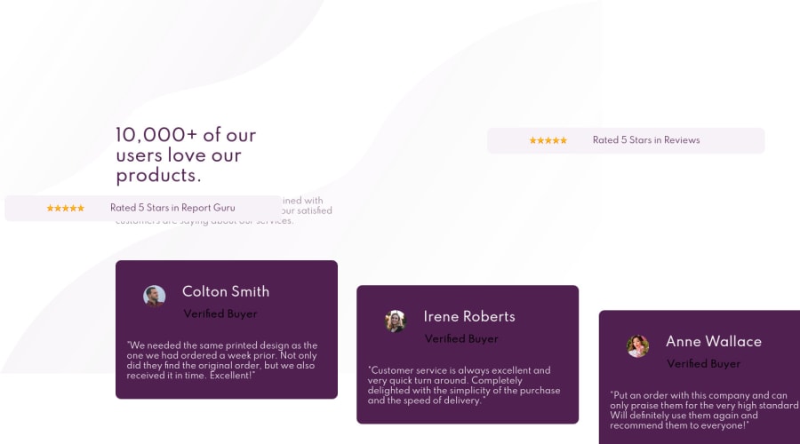
Design comparison
Solution retrospective
That was my third project, I try to do my best in order to follow the design pattern and fill it completelly, I also used only CSS and add some design responsiveness, that wasn't so tough, but I was stuck with fonts, because I couldn't add some weight to my heading and I couldn't make text wider like in the design image. To sum up, I would say it's an awesome practise for beginners. Thank you for this opportunity.
Community feedback
- @arturpawlowski5Posted almost 4 years ago
Hi Nikita,
I just made this Challenge so I have some ideas for you.
First
Think about using Flexbox for all your design. This way you have much more control over how each DIV will be shown on Desktop and Mobile. Right now all designs look ok on the Desktop but when you change to Mobile it not working.
I'm sure this will take some time to understand how Flexbox works but it is standard now to use it in Design to make it more Responsive.
Try here to know about Flexbox:
This place helps me a lot with Flexbox :).
Some ideas for your Code
Background IMGs
You use now 2 Background IMGs but you do not show where they should show.
body {
  font-size: 12px;
  font-family: 'Spartan', sans-serif;
  background-image: url("images/bg-pattern-top-mobile.svg"), url("images/bg-pattern-bottom-mobile.svg");
  background-repeat: no-repeat;
}
Try something like this to show position of this IMGs:
#example1 {
   background-image: url(../images/bg-pattern-top-desktop.svg), url(../images/bg-pattern-bottom-desktop.svg);
  background-position: left top, right bottom;
  background-repeat: no-repeat, no-repeat;
}
More here: w3school
Look too on your IMG files - right now you use files with Mobile in the name. You should use with Desktop in name
Your problem with text
You use this
.heading {
  color: hsl(300, 43%, 22%);
  text-align: center;
  font-weight: 700;
}
If you want this text to be bigger try to add some font size e.g.
font-size: 18px;Font weight you use is responsible for how "bold is text" not how big is it :)
** Body **
Right now it looks like this
body {
  font-size: 12px;
  font-family: 'Spartan', sans-serif;
  background-image: url("images/bg-pattern-top-mobile.svg"), url("images/bg-pattern-bottom-mobile.svg");
  background-repeat: no-repeat;
}
Try to add some extra line
 margin: 0;
 padding: 0;
 height: 100vh;
Margin and padding will "Delete" them from the Browser file. So your www can stretch 100% in Viewport.
Height: 100vh will make your Project 100% Height in Viewport.
I hope this will help little with your project.
1
Please log in to post a comment
Log in with GitHubJoin our Discord community
Join thousands of Frontend Mentor community members taking the challenges, sharing resources, helping each other, and chatting about all things front-end!
Join our Discord
