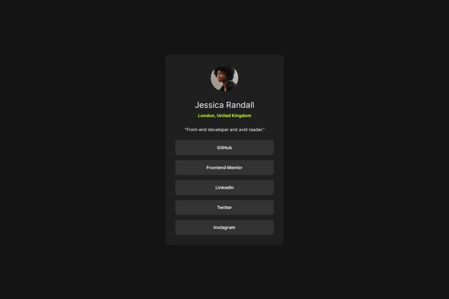
I tried using components a bit
Design comparison
Solution retrospective
I almost got it 100% . Im happy
What challenges did you encounter, and how did you overcome them?im not sure
What specific areas of your project would you like help with?I am having with font weights and sizes. That is the problem i have with all challenges so far. It is so hard to hit the weight. or maybe is the same but it looks weird on the photo.
Community feedback
- @takinabradleyPosted 10 months ago
Looks like the learner got the design nearly spot-on, nice!
I found when looking at the code, names of components like
Cardare decidedly vague. It'd expect that to perhaps be a generic card, but it comes with all the social media profile content!In regards to font-weights, I believe the style guide contains the weights that are used for this project. Might be useful if the learner didn't notice. Without looking at something like a Figma file, I have trouble with that too. The style guide can be quite vague on what exactly should be what size.
0
Please log in to post a comment
Log in with GitHubJoin our Discord community
Join thousands of Frontend Mentor community members taking the challenges, sharing resources, helping each other, and chatting about all things front-end!
Join our Discord
