

Design comparison

Please log in to post a comment
Log in with GitHubCommunity feedback
- Account deleted
Hey there!👋 Here are some suggestions to help improve your code:
- To center you content to your page, add the following to your Body Element:
body { min-height: 100vh; display: grid; place-content: center; }-
Add a
border-radiusalong with aoverflow: hiddento the component’s container. -
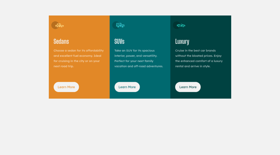
The car images/icons in this component are purely decorative; They add no value. So their Alt Tag should left blank and have an aria-hidden=“true” to hides them from assistive technology.
-
The headings in your component are being used incorrectly. Since the <h1> Heading can only be used once, it is always given to the heading with the highest level of importance. This component has three headings of equal importance, so the best option would be to use an <h2> Heading, since it is reusable and it will give each heading the same level of importance.
If you have any questions or need further clarification, let me know.
Happy Coding! 👻🎃
Marked as helpful
Join our Discord community
Join thousands of Frontend Mentor community members taking the challenges, sharing resources, helping each other, and chatting about all things front-end!
Join our Discord