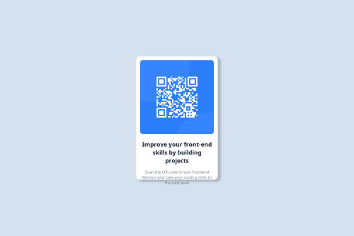
Submitted about 1 year agoA solution to the QR code component challenge
I tried it to be the same
@SecretsofArea51

Solution retrospective
What are you most proud of, and what would you do differently next time?
this is the first thing i made,next would be better
What challenges did you encounter, and how did you overcome them?how to center a div
What specific areas of your project would you like help with?i couldn't find the right font and tried my best to match the text color and font weight felt a little off
Code
Loading...
Please log in to post a comment
Log in with GitHubCommunity feedback
No feedback yet. Be the first to give feedback on Ravi Kumar Bind's solution.
Join our Discord community
Join thousands of Frontend Mentor community members taking the challenges, sharing resources, helping each other, and chatting about all things front-end!
Join our Discord