Submitted 4 months ago
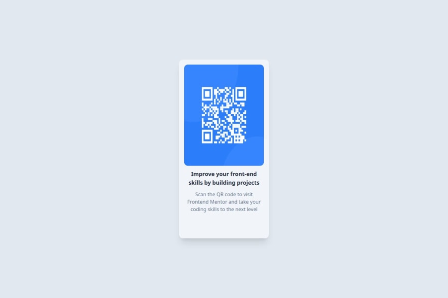
I solved the challenge using React with Tailwind
#react#tailwind-css#typescript#vite
@salehalakhras
Design comparison
SolutionDesign
Solution retrospective
What are you most proud of, and what would you do differently next time?
I'm proud of the way it turned out.
What challenges did you encounter, and how did you overcome them?the main challenge was the sizing of the box for each screen size, it took a lot of trail and error
What specific areas of your project would you like help with?the mobile and the desktop layout is easy, the hard part is the area in between, is there any way to make that easier?
Community feedback
Please log in to post a comment
Log in with GitHubJoin our Discord community
Join thousands of Frontend Mentor community members taking the challenges, sharing resources, helping each other, and chatting about all things front-end!
Join our Discord
