Submitted about 1 year ago
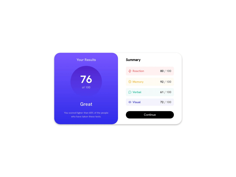
I only used Vanilla Html and Css and used only flex.
@Josephadam
Design comparison
SolutionDesign
Solution retrospective
What did you find difficult while building the project? I would say I had time figuring out how to add the right side to where the two column are combined into one another. I ended asking chatgbt and it came up with using a background color to split the two.
Which areas of your code are you unsure of? Im curious how could you make it better looking for mobile for screen sizes 1024px and 564px.
Do you have any questions about best practices? I used only flex to build this.
Community feedback
Please log in to post a comment
Log in with GitHubJoin our Discord community
Join thousands of Frontend Mentor community members taking the challenges, sharing resources, helping each other, and chatting about all things front-end!
Join our Discord
