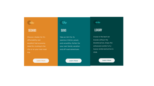
Submitted over 4 years agoA solution to the 3-column preview card component challenge
I only used position relative to align the cards and Flex box
@joel-elyon-nwamba

Solution retrospective
Hey guys this was my first attempt I know I most likely am missing a lot of things. Welcome any tips on how I could have done it better.
Code
Loading...
Please log in to post a comment
Log in with GitHubCommunity feedback
No feedback yet. Be the first to give feedback on Joel Nwamba's solution.
Join our Discord community
Join thousands of Frontend Mentor community members taking the challenges, sharing resources, helping each other, and chatting about all things front-end!
Join our Discord