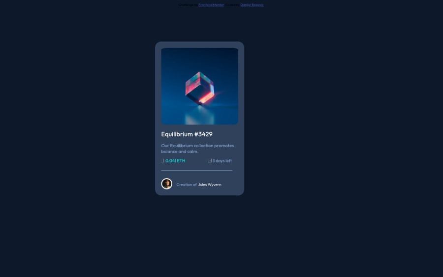
Design comparison
Solution retrospective
hy there. What is the easiest way to put everything in the middle. Im trying with align items, margin... but on the end nothing works properly, any tip? I made hocer on img, but how to make hover in color? I couldnt find answer online....
Community feedback
- @elaineleungPosted about 2 years ago
Hi Danijel, I think this is a good try here, and I'm amazed you managed to put together everything using mostly
position: absolute
!To answer your question, there is definitely a much easier way. What I would do is, I would remove all the
position: absolute
as well as the other position properties (e.g., top, left). In the body element, to center everything quickly, I'd write:body { min-height: 100vh; display: grid; place-content: center; }
There are more things I'd change, but I think I'll only point out three main areas that you can use even in other challenges:
-
Always add reset/normalize styles rules at the top of the sheet, either using a CSS reset sheet or normalize.css. This is because every browser has some default styles, and to make sure your design looks fairly uniform across different browsers, we "reset" or "normalize" the styles. Here are two simple ones that I'd add in your project at the top:
// for border-box *, *::before, *::after { box-sizing: border-box; } // for images img { max-width: 100%; display: block; }
-
Instead of using a fixed width, use a responsive width property. What I'd do here, I'd add
max-width: 400px
on your card div and then remove the fixed width and height of your image and also card div. This way, your card can shrink down if the browser width gets smaller. -
You can use padding and margins to help you position items within a container instead of using
position: absolute
. To start, use a padding in your card div instead of adding padding in individual elements. I'd add apadding: 1rem
to your card div and remove all thepadding-left
andpadding-right
. This is a lot more economical and makes most sense.
I'm not sure whether you know what grid and flexbox are because I don't see you using them in this solution, and if you don't, I highly recommend learning it first, or else you will run into more difficulties in later challenges.
In looking at your code, I get the sense that you may firstly need to understand how containers work. Using
position: absolute
is a bit like in design where you give each element a fixed place in the X/Y axis. In most of the CSS we write, we actually depend on the relationships between the boxes (usually between a parent and child box, and also between the sibling boxes). Right now, your code is a bit like what happens if I'm trying to pack a suitcase, and I take each item and tape it inside my suitcase. That of course is not necessary, because as long as the item is in the suitcase, then its not going to leave unless you move it elsewhere (which you can do usingposition: absolute
). If you want to put a pair of pants next to a jacket, you don't need tape for that, you simply need to place them one beside the other. Also, if you want to pack your socks, you might want to throw them in another bag first instead of putting them individually in the suitcase, and that way it'd be easier to find them all and/or move them all to another place. In short, what you need to learn now is how to use the parent container (i.e., the suitcase) to position all the child elements within it, and how to position those sibling elements. I think the easiest way to do that is really by learning flexbox.I hope some of this helps you out; you can check out my solution to this challenge here and see whether that gives you any ideas.
Good luck, and I do hope you try this challenge again without
position: absolute
!Marked as helpful1@RedPitcherPosted about 2 years agoHi @elaineleung, thank you for this awesome feedback. I really appreciate it! I'm new in coding world (a week),so this really helps me a lot! I'm turning youtube on and starting with grid and flexbox: Thank you!
1@elaineleungPosted about 2 years ago@RedPitcher Glad to help, Danijel, and yes I highly recommend Kevin Powell's YouTube channel, as well as his website which has a some free courses. He's done a few Frontend Mentor challenge videos, and I think you should definitely check those out to see how he works through a FEM challenge from start to finish. He also does a really good job teaching grid and flexbox in his videos, and probably most of my CSS knowledge comes from him. Good luck!
0 -
Please log in to post a comment
Log in with GitHubJoin our Discord community
Join thousands of Frontend Mentor community members taking the challenges, sharing resources, helping each other, and chatting about all things front-end!
Join our Discord