Design comparison
Community feedback
- @Rohitgour03Posted almost 3 years ago
Well done, 👍😍 @Markizzo You have done a nice job, the design is looking good.
Just try to improve on these things
-
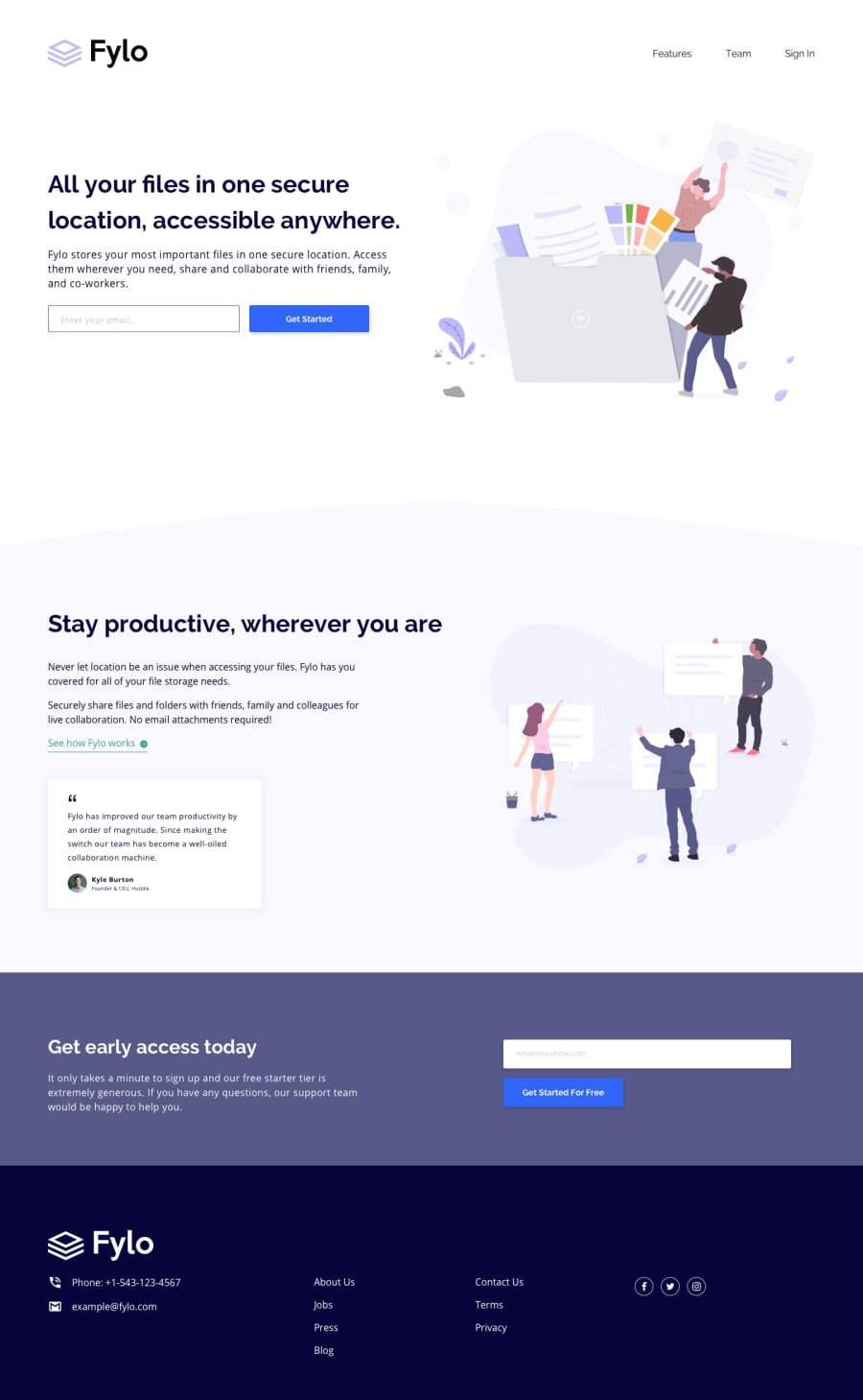
As I can see in your solution the headings can be improved by making them bold.
-
The navigation links are too bold, try to reduce the font-weight in navigations links.
-
The Call to actions button text is not that visible because of less font-weight, increase it too. 4. The bottom CTA button is somewhat big, make it a little bit small and add some dark color in box-shadow as the light color shadow is looking not that good.
-
The section above the footer should need some space at the top, there is so much at the bottom. Just reduce that.
-
your Navbar also needs some space at its top.
-
Footer links are a little bit small and light-weighted, try to make them a little bigger and bolder.
-
Your HTML lacks the main tag, try to put all the sections in the main tag.
-
Use the headings in the order, you can't just put h1, and just after that you instead of putting h2 you put h3 or h4. This is because the page should follow some better structure so that can be accessible to all.
All things other than that are just fine, Hope that helps you. 👍 Keep trying, keep hustling, stay healthy. 😀💪
Marked as helpful1@MarkWasfy00Posted almost 3 years ago@Rohitgour03 man you actually gave me some good instructions i really appreciate your support , i hope you have a good day !
1 -
Please log in to post a comment
Log in with GitHubJoin our Discord community
Join thousands of Frontend Mentor community members taking the challenges, sharing resources, helping each other, and chatting about all things front-end!
Join our Discord
