

Design comparison
SolutionDesign

Solution retrospective
What are you most proud of, and what would you do differently next time?
nil
What challenges did you encounter, and how did you overcome them?nil
What specific areas of your project would you like help with?nil
Community feedback
- @MehradJPosted 6 days ago
I think you should consider the space from each side. (margins and padding) You can improve your CSS file, and you don't need to change the font size when you use rem. For the header image, you can use "img srcset" like this...
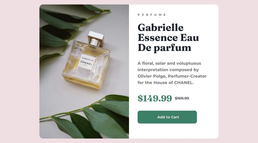
<picture>
        <source srcset="assets/images/image-product-mobile.jpg" media="(max-width: 590px)">
        <source srcset="assets/images/image-product-desktop.jpg" media="(min-width: 591px)">
        <img class="card-img" src="assets/images/image-product-mobile.jpg" alt="Chanel Perfume">
      </picture>
Good job, keep it up!
0

Please log in to post a comment
Log in with GitHubJoin our Discord community
Join thousands of Frontend Mentor community members taking the challenges, sharing resources, helping each other, and chatting about all things front-end!
Join our Discord