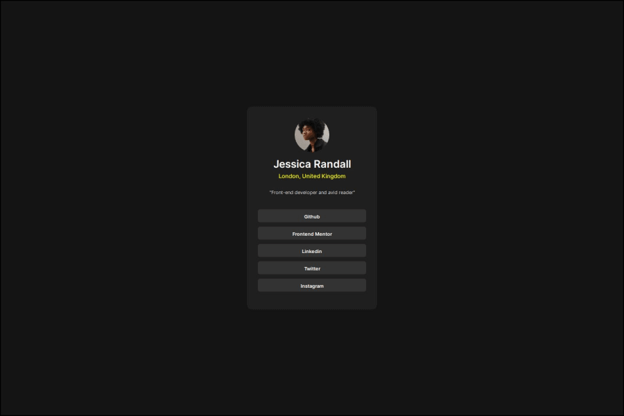
I made use of the list property, and hover pseudoclass, margin and pad
Design comparison
Solution retrospective
I'm proud that as a newbie i hae been able to do this as it required a lot of focus, and i look to keep doing this more often. In my next challenges, i will be writing the steps to follow to achieve the result i need
What challenges did you encounter, and how did you overcome them?Had challenges with deploying at first with netlify, but i used vercel instead.
Community feedback
- @danielmrz-devPosted 8 months ago
Hello @j7st-ralph!
Your solution looks excelent!
I have just one suggestion:
📌 To improve semantic clarity, opt for
<h1>over<h3>for your main title.It's more than just text size — it's about structuring your content effectively:
<h1>to<h6>are used to define HTML headings, with<h1>being the most significant.- Stick to one
<h1>per page for the main title, and maintain the titles hierarchy with<h1>,<h2><h3>, and so on.
While these adjustments might not alter the visual appearance much, they significantly enhance semantic clarity, SEO optimization, and accessibility.
Hope this suggestion proves helpful! Keep up the great work!
Marked as helpful1
Please log in to post a comment
Log in with GitHubJoin our Discord community
Join thousands of Frontend Mentor community members taking the challenges, sharing resources, helping each other, and chatting about all things front-end!
Join our Discord
