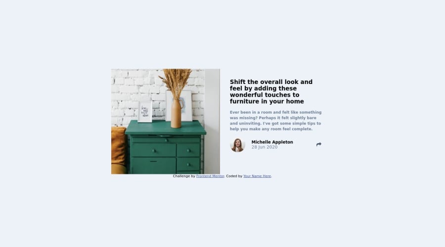
i look for you feedback guys, feel free to say even negative
Design comparison
Community feedback
- @CheFernandez99Posted over 1 year ago
great effort just a few things. you should change the background colour of the right box in mobile you should make the width the same as the box width, make the colours solid not transparent. for mobile optimization it helps to open the port on your mobile phone.
Marked as helpful0@SamehCodePosted over 1 year ago@CheFernandez99 thank you i already made the text width 100% in mobile screen u can check it on inspect um, i also changed the text background not to be transparent i hope u check it out and feed me back again , thanks :)
0@CheFernandez99Posted over 1 year ago@SamehCode the share box appears behind the card now on mobile make sure the position is absolute. Then use top and left to adjust
1 - @CheFernandez99Posted over 1 year ago
hi I copied your code from git hub, i will edited the issues and send the edits back to you! if you like it you can merge it with your original code, if not then you don't have to. let me know what you think?
1@SamehCodePosted over 1 year ago@CheFernandez99 i'd like to thank you for first and yes i want you to show me you idea but i won't merge it , i will try to do it my self instead of merging to train myself
0@CheFernandez99Posted over 1 year ago@SamehCode hi, awesome I'll try it myself and send it to you👍
1@SamehCodePosted over 1 year ago@CheFernandez99 now i think i got what u mean, u mean on mobile screen i make the width 100% full screen isn't it ?
0
Please log in to post a comment
Log in with GitHubJoin our Discord community
Join thousands of Frontend Mentor community members taking the challenges, sharing resources, helping each other, and chatting about all things front-end!
Join our Discord
