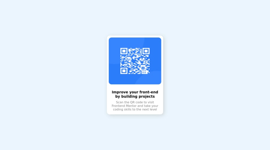
Design comparison
Community feedback
- @HassiaiPosted almost 2 years ago
Replace <div class="container"> with the main tag and <h3> with <h1> to fix the accessibility issues. click here for more on web-accessibility and semantic html
To center .container on the page using flexbox or grid instead od position: absolute, add min-height:100vh; display: flex; align-items: center: justify-content: center; or min-height:100vh; display: grid place-items: center to the body.
To center .container on the page using flexbox:
body{
min-height: 100vh;
display: flex;
align-items: center;
justify-content: center;
}
To center .container on the page using grid: body{ min-height: 100vh; display: grid; place-items: center; }the body has a wrong background-color. Use the colors that were given in the styleguide.md found in the zip folder you downloaded.
Replace the height in .container with a padding value fo r all the sides, this will prevent the content from overflowing on smaller screens and its a responsive replacement.
padding:16px. For a responsive content replace the width in .container withmax-width.There is no need to style .image, give the img a max-width of 100% for a responsive image. There is no need to give the img a margin-top and bottom value.
Give .description a margin value for all the sides, text-align: center and a font-size of 15px which is 0.9375rem, this will be the font-size of both p and h1. Give p a margin-top valu for the space between the text.
Use relative units like rem or em as unit for the padding, margin, width values and preferably rem for the font-size values, instead of using px which is an absolute unit. For more on CSS units Click here
Hope am helpful.
Well done for completing this challenge. HAPPY CODING
Marked as helpful0@ahmed-sabbah-mohamedPosted almost 2 years ago@Hassiai thank you so much you. I appreciate your feedback and i hope to you the best luck.
0 - @frank-itachiPosted almost 2 years ago
Hello there 👋. You did a good job!
I have some suggestions about your code that might interest you.
HTML 📄:
- Wrap the page's whole main content in the
<main>tag. - If your code has different sections that have a specific purpose like a navigation, article, sections or footer, it’s a good practice to enclose those parts with HTML5 landmarks. For example, you could use a
<footer>tag to wrap the<div class=”attribution”>section. - The heading order is important in the html structure so try to always start your headings with an
<h1>tag and then you can decrease by one if you need to use more heading in your html code.
CSS 🎨:
- You can use grid or flexbox to center the content no matter the viewport size. Since I use grid to achieve such purpose, you can do the following:
body {
	min-height: 100vh;
        display: grid;
	align-items: center;
	justify-content: center;
}
As I said, you can use flexbox to center the content and it will work as well.
body {
	min-height: 100vh;
        display: flex;
	align-items: center;
	justify-content: center;
}
I hope you find it useful! 😄 Above all, the solution you submitted is great!
Happy
<coding />😎!Marked as helpful0@ahmed-sabbah-mohamedPosted almost 2 years ago@frank-itachi thank you for your help and i will be very careful about your feed back and it will be great to improve my skills.
0 - Wrap the page's whole main content in the
Please log in to post a comment
Log in with GitHubJoin our Discord community
Join thousands of Frontend Mentor community members taking the challenges, sharing resources, helping each other, and chatting about all things front-end!
Join our Discord
