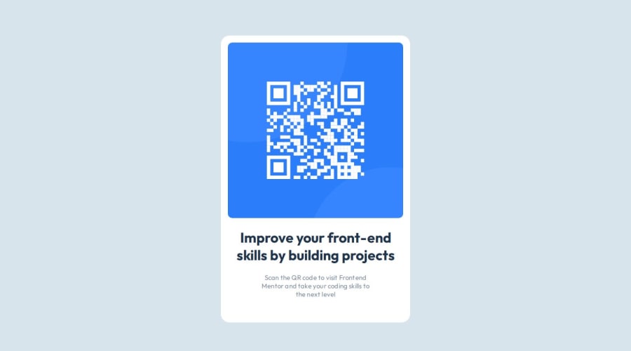
Design comparison
SolutionDesign
Solution retrospective
What are you most proud of, and what would you do differently next time?
As of now, I don't know very much about CSS. So I only used raw CSS to style the card and next time, I will do this with some library, etc.
Live Link (https://frontend-mentor-qr-code-self.vercel.app/)
What challenges did you encounter, and how did you overcome them?Difficulties
- One should know how the display works in CSS.
- Grids and flexbox can be a bit complex task.
- I end up using grids as they are more comfortable to work with.
No, thanks as this is my first project of this kind, I'll gradually improve.
Community feedback
- @rufusshakin300Posted about 1 year ago
hey, bro you forgot google fonts and body font-size : 15px is give in readme it's not a big deal Keep trying best of lucky
0
Please log in to post a comment
Log in with GitHubJoin our Discord community
Join thousands of Frontend Mentor community members taking the challenges, sharing resources, helping each other, and chatting about all things front-end!
Join our Discord
