Submitted about 1 year ago
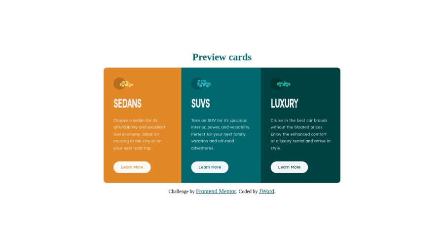
I just did mobile first with vanilla css. A little flexbox.
@jwren4170
Design comparison
SolutionDesign
Solution retrospective
This one was pretty easy.
Community feedback
- @VCaramesPosted about 1 year ago
Hey there! 👋 Here are some suggestions to help improve your code:
- A crucial is element missing from your code, which should always be included, whether it's a component or a full website, is the
mainelement. Its presence is essential for maintaining good semantics and accessibility, as it assists in identifying the primary content of your site.
- In this specific challenge, the icons serve a purely decorative purpose. So, it is best to leave their
alttag blank (alt="") to signal to screen readers that these elements should be disregarded.
- The
h1heading should be used only once per page. In your code, it's employed multiple times. To adhere to best practices, it's if you use theh2heading instead for subsequent headings.
- For the "learn more" buttons, users are likely to be directed to another section of your website when they interact with them, it would be more appropriate to use the
anchor(<a>) element to achieve this functionality.
- Since you are utilizing the
<div class="attribution">provided by FEM, it's advisable to wrap it in afooterelement to enhance the semantics of your HTML structure.
If you have any questions or need further clarification, feel free to reach out to me.
Happy Coding! 👾
1 - A crucial is element missing from your code, which should always be included, whether it's a component or a full website, is the
Please log in to post a comment
Log in with GitHubJoin our Discord community
Join thousands of Frontend Mentor community members taking the challenges, sharing resources, helping each other, and chatting about all things front-end!
Join our Discord
