I did not use any property for this yet.


Design comparison

Solution retrospective
My most proud of is working with image, borders, width and colors. By next time I will be working with Layout and positioning.
What challenges did you encounter, and how did you overcome them?The most challenge I encounter was giving out the correct colors and width but I overcome by going through the Readme.md file.
What specific areas of your project would you like help with?I may like to get help from the following areas: layout, colors, working with perfect width.
Community feedback
- @rameesha0126Posted about 2 months ago
Replace <div class="container"> with the main tag (<main class="background"). Inside the main tag add a div (<div class="card-component">) that will hold the <img/> and the text sections. Do not use too many <div> tags. For the heading use <h1> tags, and for the paragraph use <p> tags to fix accessibility issues. Fix the issues with <b> tags in place. To center .background on the page, add min-height:100vh; display: flex; align-items: center: justify-content: center; or min-height:100vh; display: grid place-items: center to the body.
Give .background a background of white a padding value for all the sides, give the <img> a max-width of 100% instead of a width. For responsive content, replace the width of .background with max-width and change the height's value to auto.
Give .card-component padding values and a fixed width value.
Use rem or em as unit for the padding, margin, width and preferably rem for the font-size.
Marked as helpful0 - @xaintobasPosted 9 months ago
Hi @MaryAMsendoo,
Nice work on your design! Here are a few opportunities to enhance it:
-HTML Structure and Semantics:
Your code uses nested
<div>elements which can make the structure harder to follow.I will suggest you use
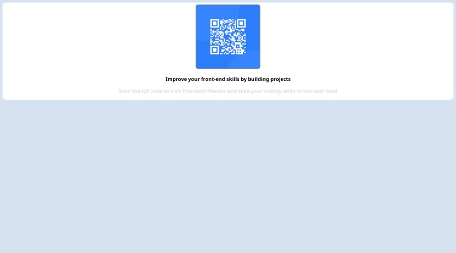
<main>and<section>elements. It is a great improvement in terms of semantic HTML. This makes the content more meaningful and accessible.<main> <section class="card"> <img src="https://maryamsendoo.github.io/firstchallenge/img1.png" alt=""> <h1>Improve your front-end skills by building projects</h1> <p>Scan the QR code to visit Frontend Mentor and take your coding skills to the next level</p> </section> </main>-Flexbox for Centering:
Your code uses
marginfor centering elements, which is not as flexible. I will suggest you use Flexbox in the main element to center the content. This makes the layout more responsive and easier to manage.main { display:flex; flex-direction:column; justify-content:center; align-items:center; width:100vw; height:100vh; background-color: hsl(212, 45%, 89%); }-Styling Improvements:
Your CSS has some issues, such as
width: 50%pxfor the.containerdivwhich I believe is a typo. You should consider fixing this. But here are some improvements you should also consider:Using
max-width: 320pxto ensure the card does not become too wide on larger screens..card { background-color:white; max-width:320px; text-align:center; border: 15px solid white; border-radius: 14px; }Consider adding an
h1element and also styling your image for responsivenessh1{ font-size:1.6rem; } img{ width:100%; }I hope you find my feedback valuable and helpful.
If yes, I would appreciate it greatly if you could mark my comment as helpful!
Keep coding
0@MaryAMsendooPosted about 2 months ago@xaintobas thanks so much and sorry just getting to receive this mail now. I have improved on my design and seeing this on time would have help more better. https://maryamsendoo.github.io/ Here is my portfolio.... I'll want more reviews
0


Please log in to post a comment
Log in with GitHub
Join our Discord community
Join thousands of Frontend Mentor community members taking the challenges, sharing resources, helping each other, and chatting about all things front-end!
Join our Discord