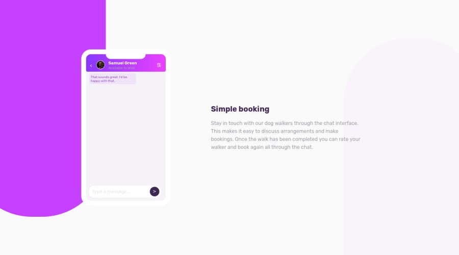
I did animation for chat balloons with javascript in this challenge
Design comparison
Solution retrospective
What you think about my codes and how looking it? How may ı improve myself in front-end ? What you advice? Thank you very much for your feedback in advance.
Community feedback
- @jkeownPosted over 3 years ago
the animated pop-ups get cut off towards the end so the view should scroll also
0@NesrindzgPosted over 3 years ago@jkeown Yes i noticed that and i will work fix it. Thank you Jared
0 - @A-amonPosted over 3 years ago
Hello! First off, great work! I like the messages appearing one after another like an actual chat app 😁
Here are a few suggestions:
- For
<input type='submit'>, changewidth:15%;towidth:25px;(Same as height's value). This will fix the not so rounded button. - I am guessing you used
position:absolute;on<footer>because without it, it will overflow the phone. 🤔 But right now, the input field is covering some of the final messages. One way to fix this is by addingpadding-bottomto<main>or by doing:
/* For .phone */
display:flex;
flex-direction:column;
/* For main */ flex:1; overflow:auto;And also remove the position:absolute; related stuffs from
<footer>(If you're following the 2nd way)- Put the two <input> inside footer into a <form>
- As for the accessibility report, check out landmarks and put an alt text for your avatar image 😀
0@NesrindzgPosted over 3 years ago@A-amon Hi! First of all, thank you for your nice comments and I will take your suggestions into consideration. :)
0 - For
Please log in to post a comment
Log in with GitHubJoin our Discord community
Join thousands of Frontend Mentor community members taking the challenges, sharing resources, helping each other, and chatting about all things front-end!
Join our Discord
